
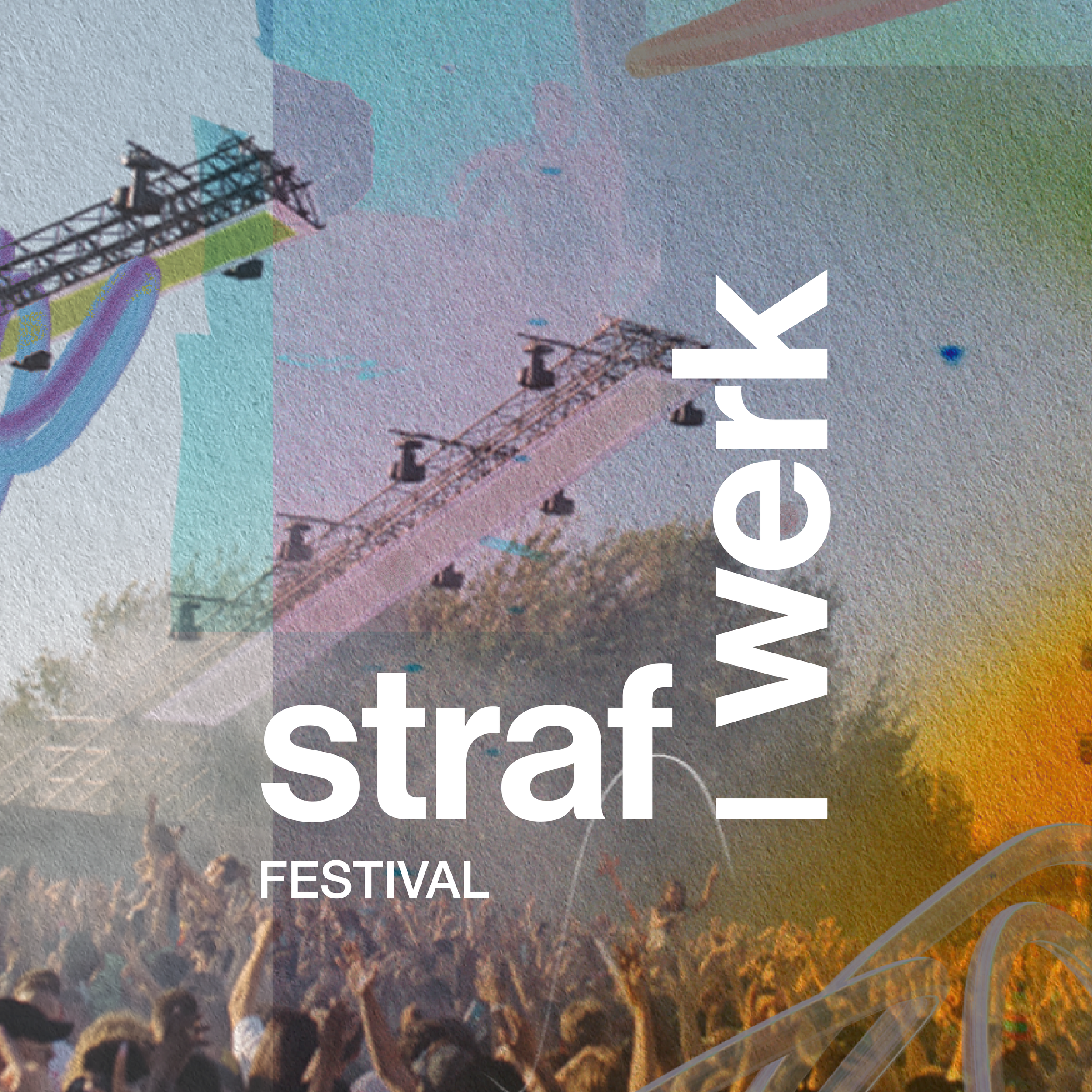
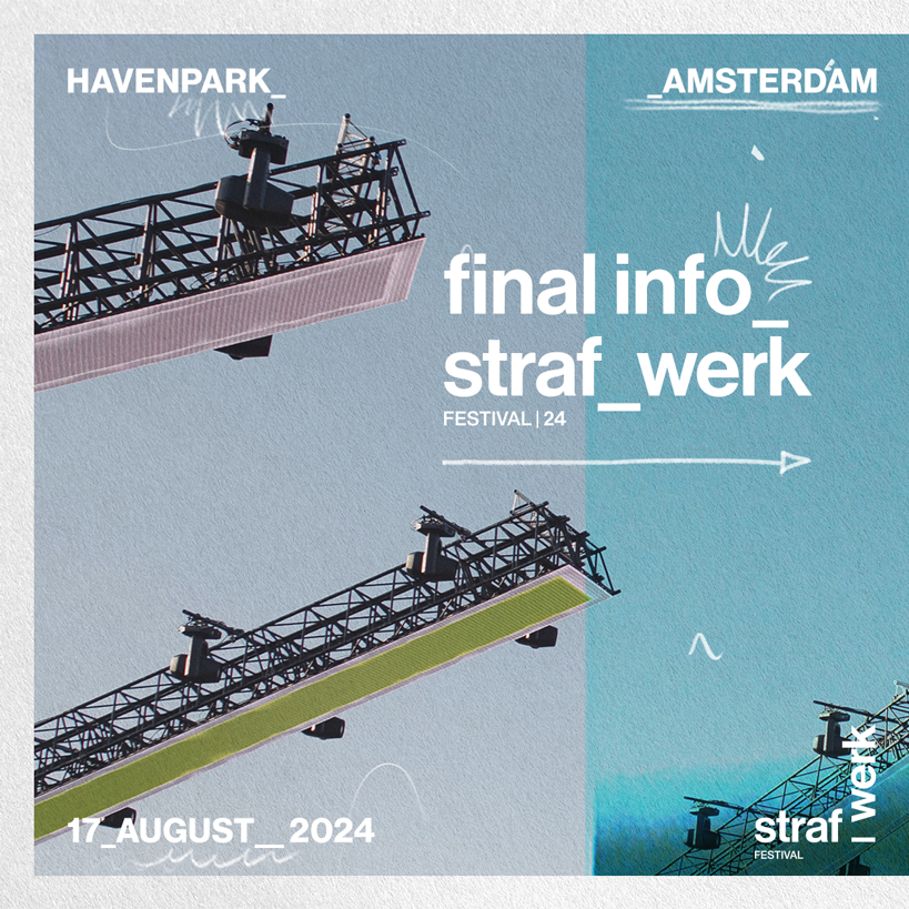
strafwerk Rebrand & Concept Development_
A rebrand that captures the chaos, curiosity, and energy of becoming an adult — standing at the edge of nightlife, identity, and everything in between.
Client
straf_werk
Year
2023 - 2024
My Role_
Together with the marketing and content team, I developed the new brand concept and visual direction for straf_werk, used across all events from 2024 onwards.
I created the concept, designed the key artworks, and wrote the brand guidelines to make sure everything connected visually and conceptually.
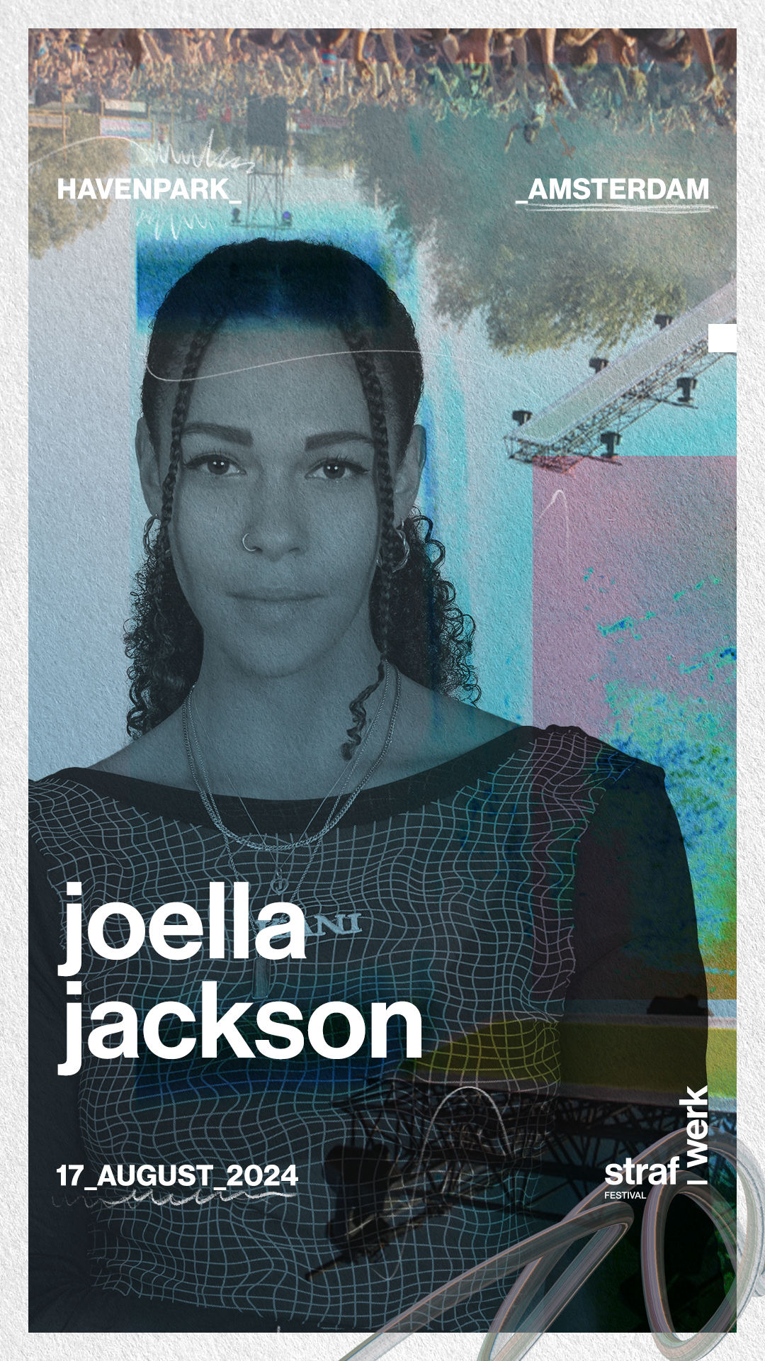
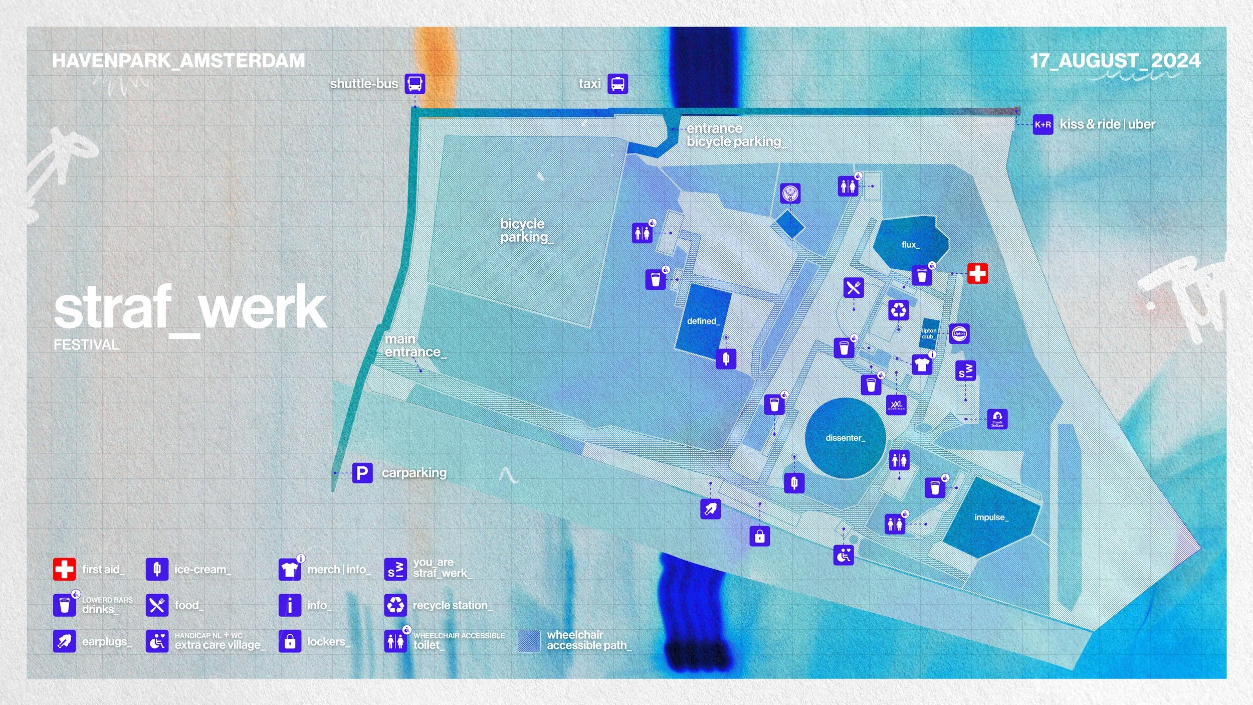
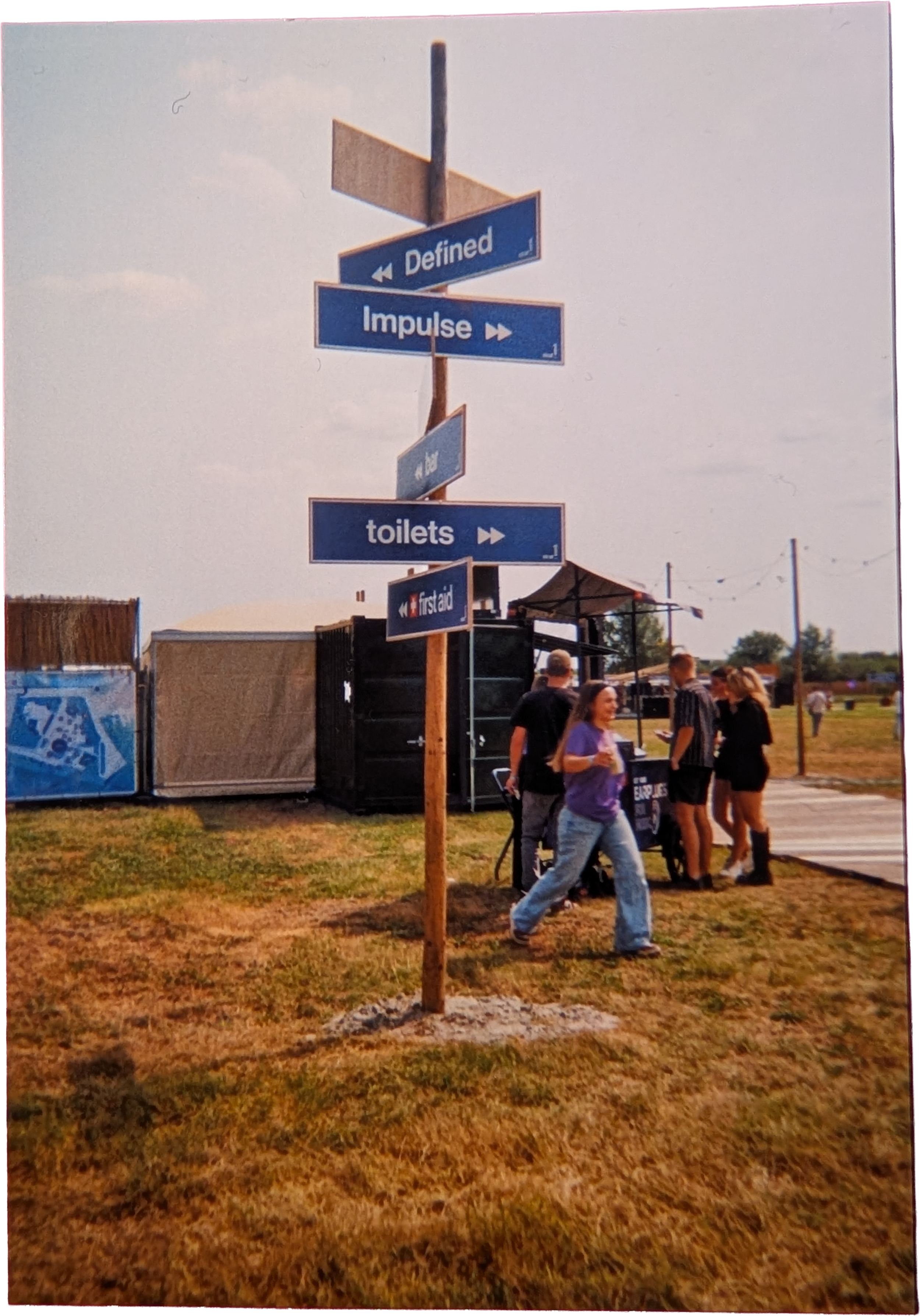
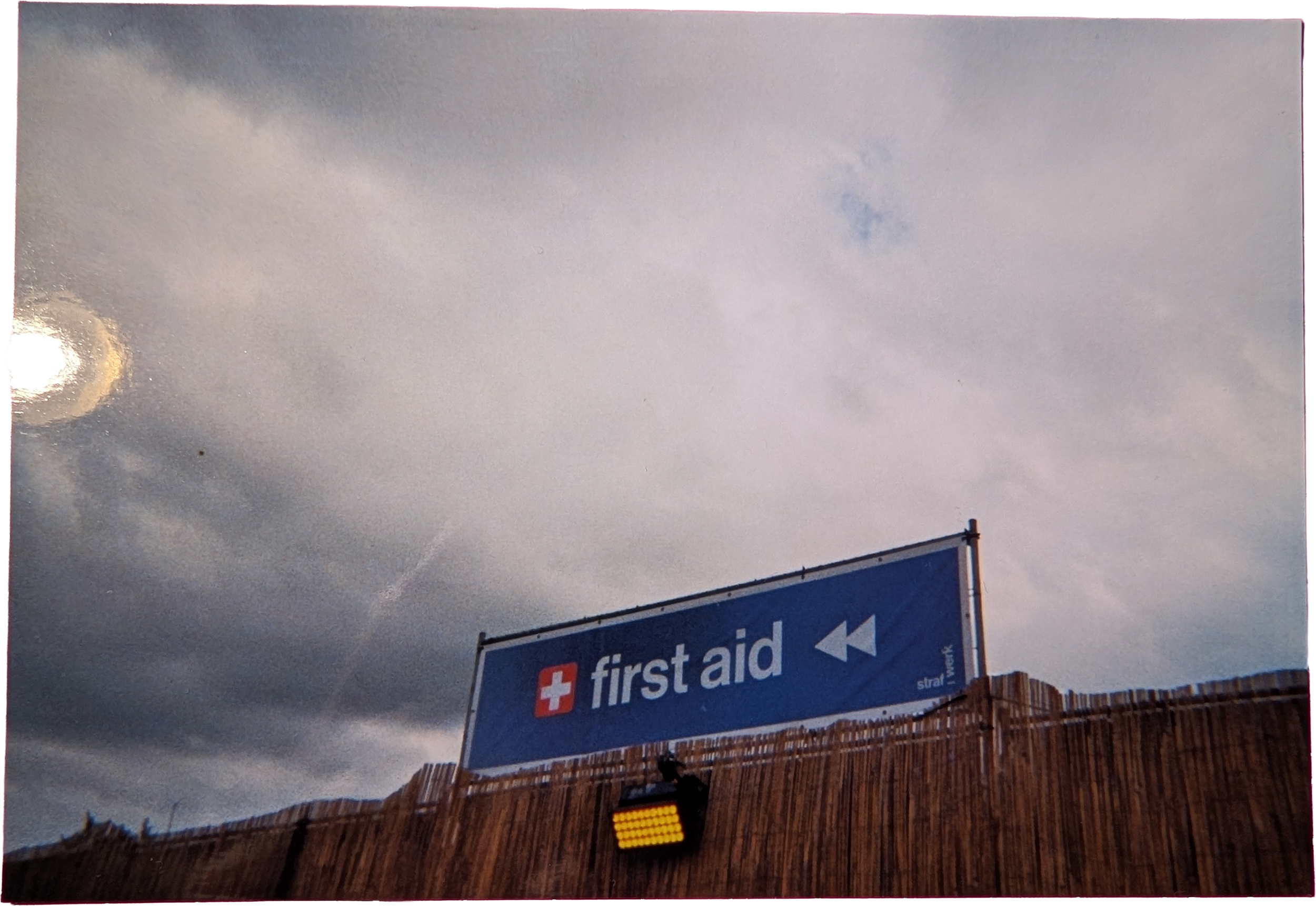
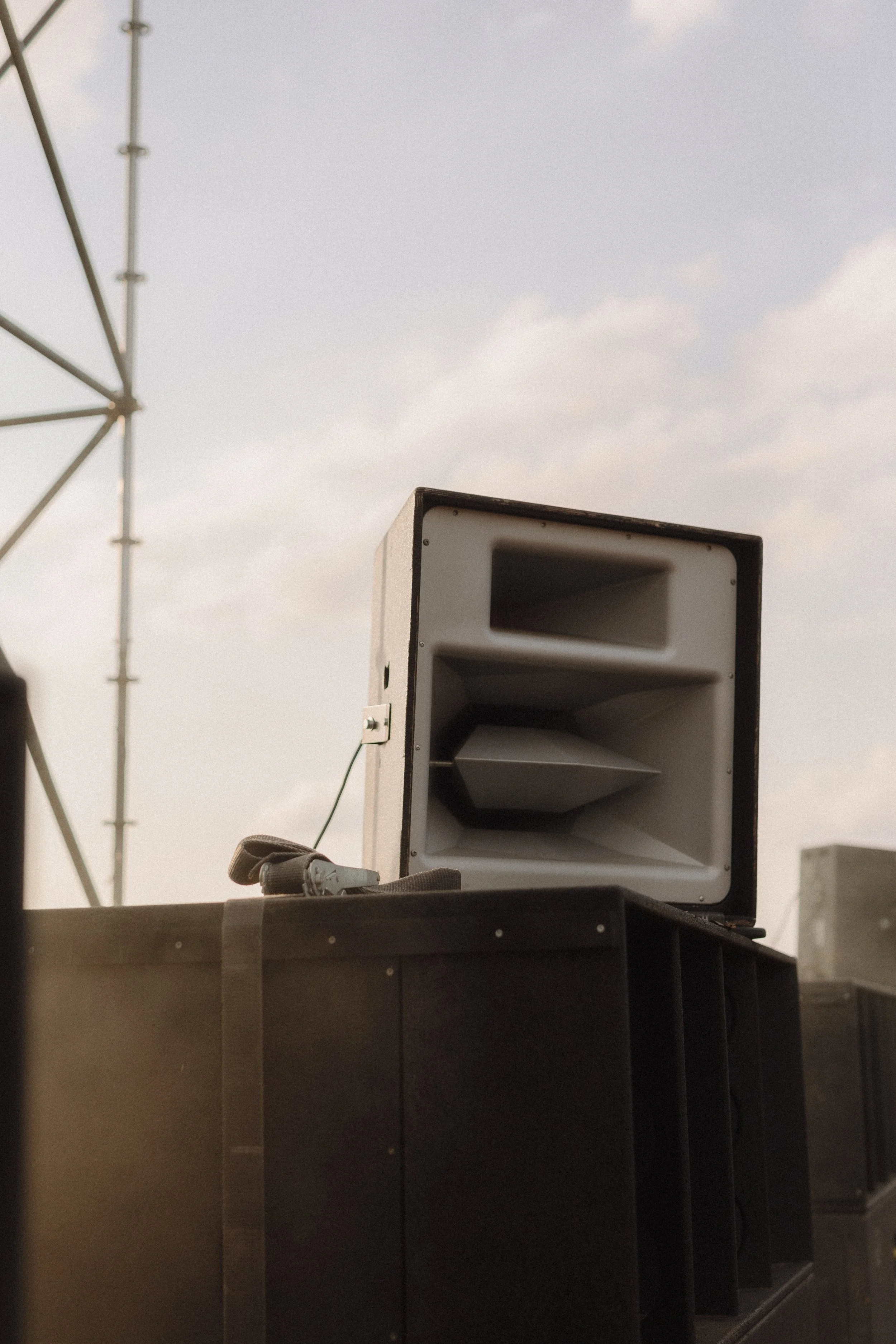
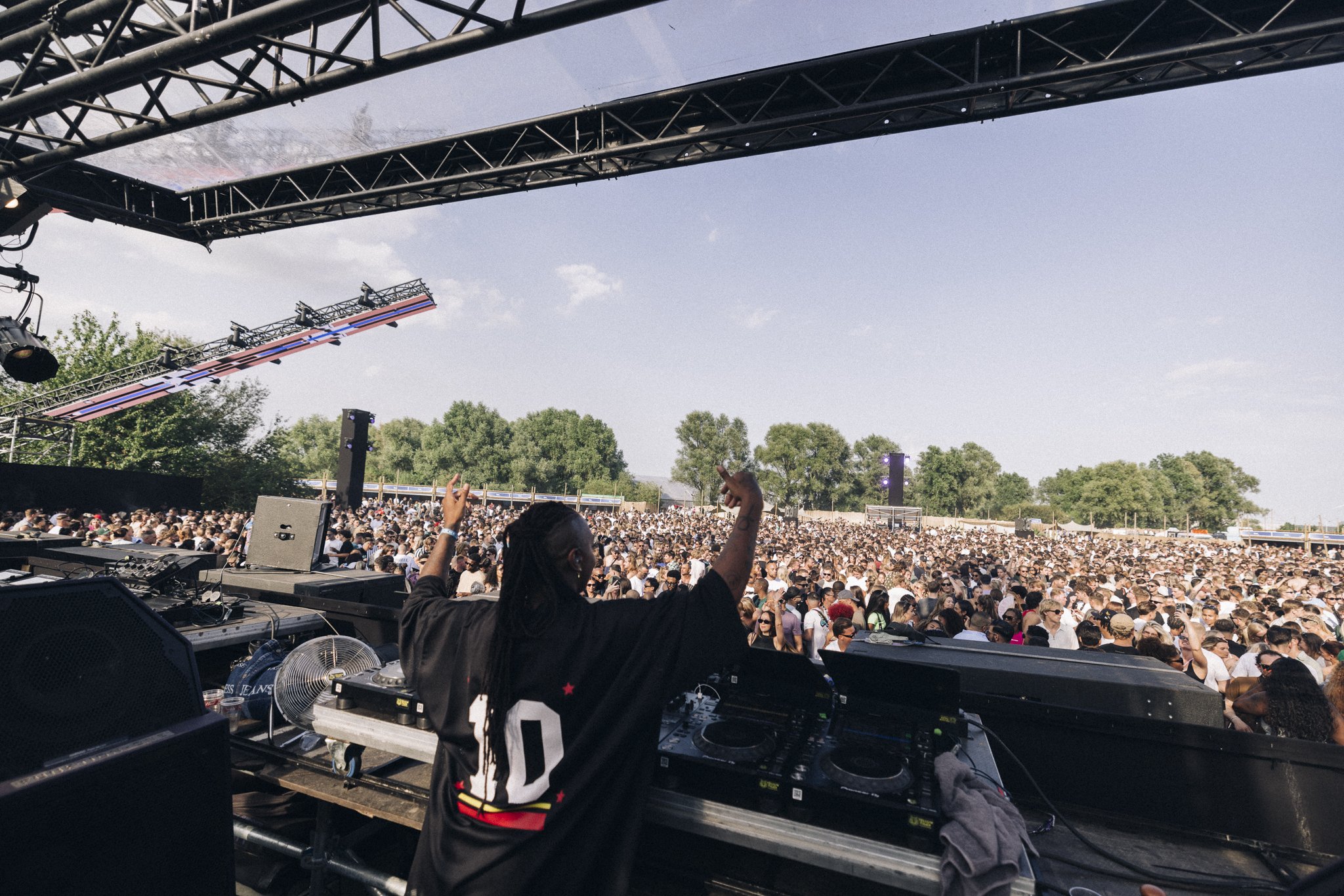
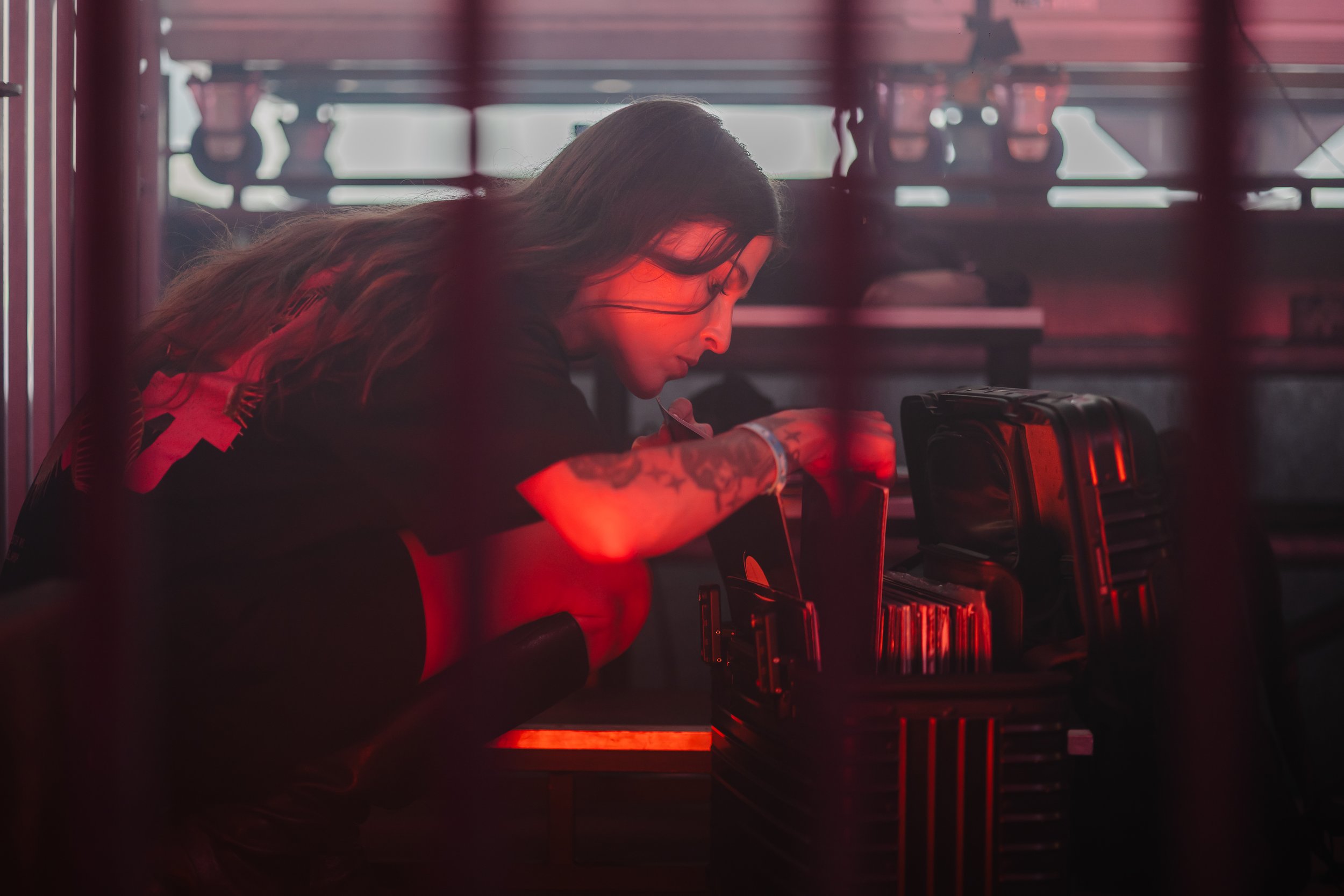
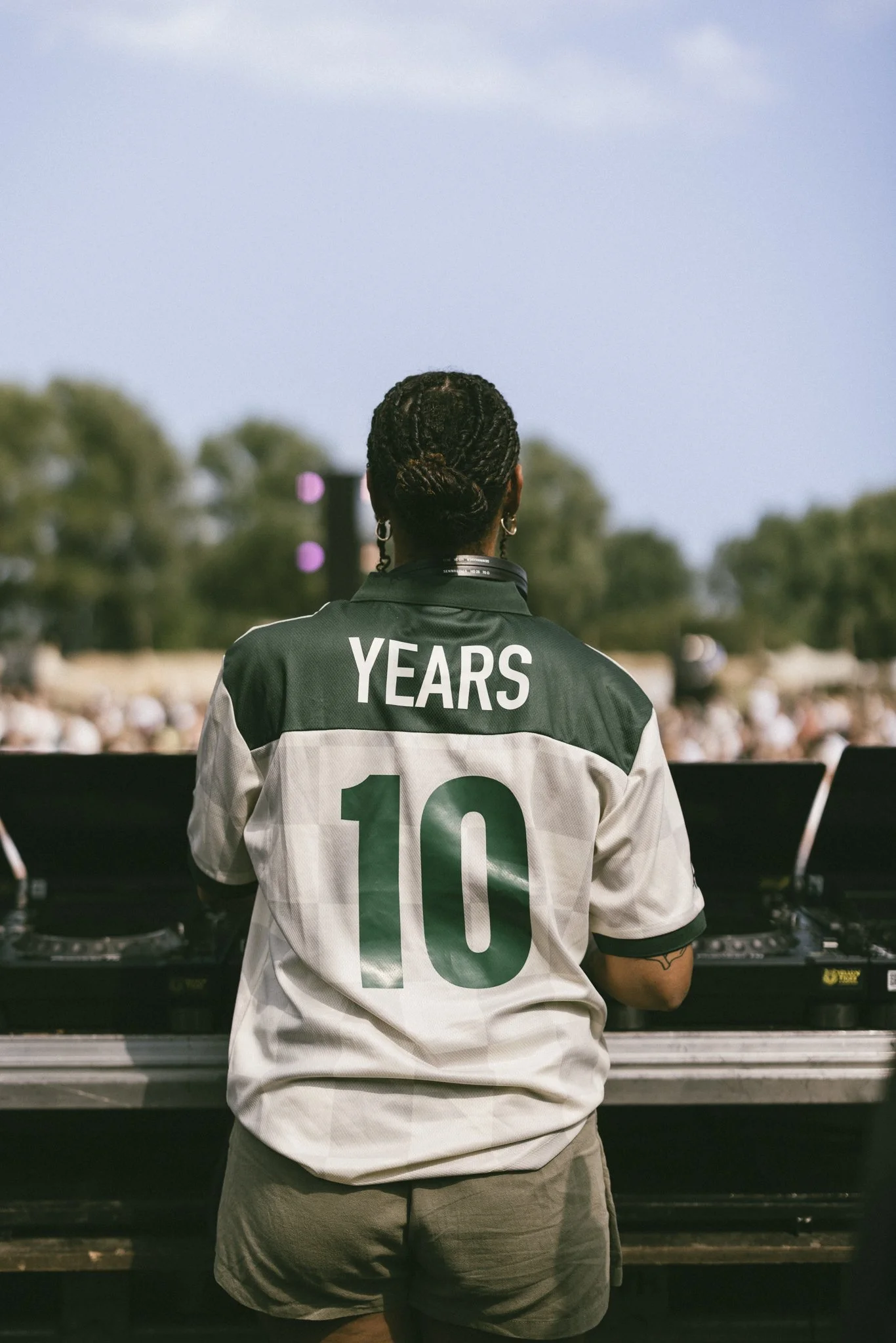
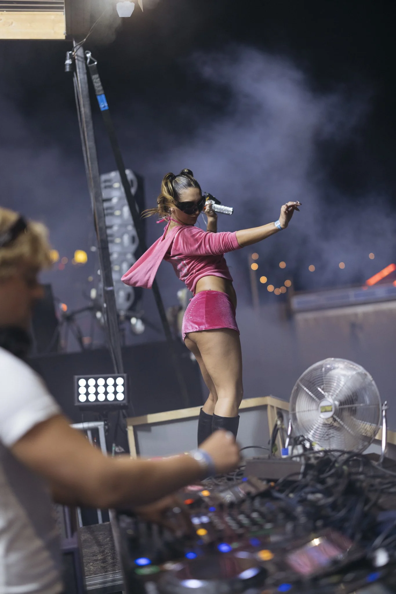
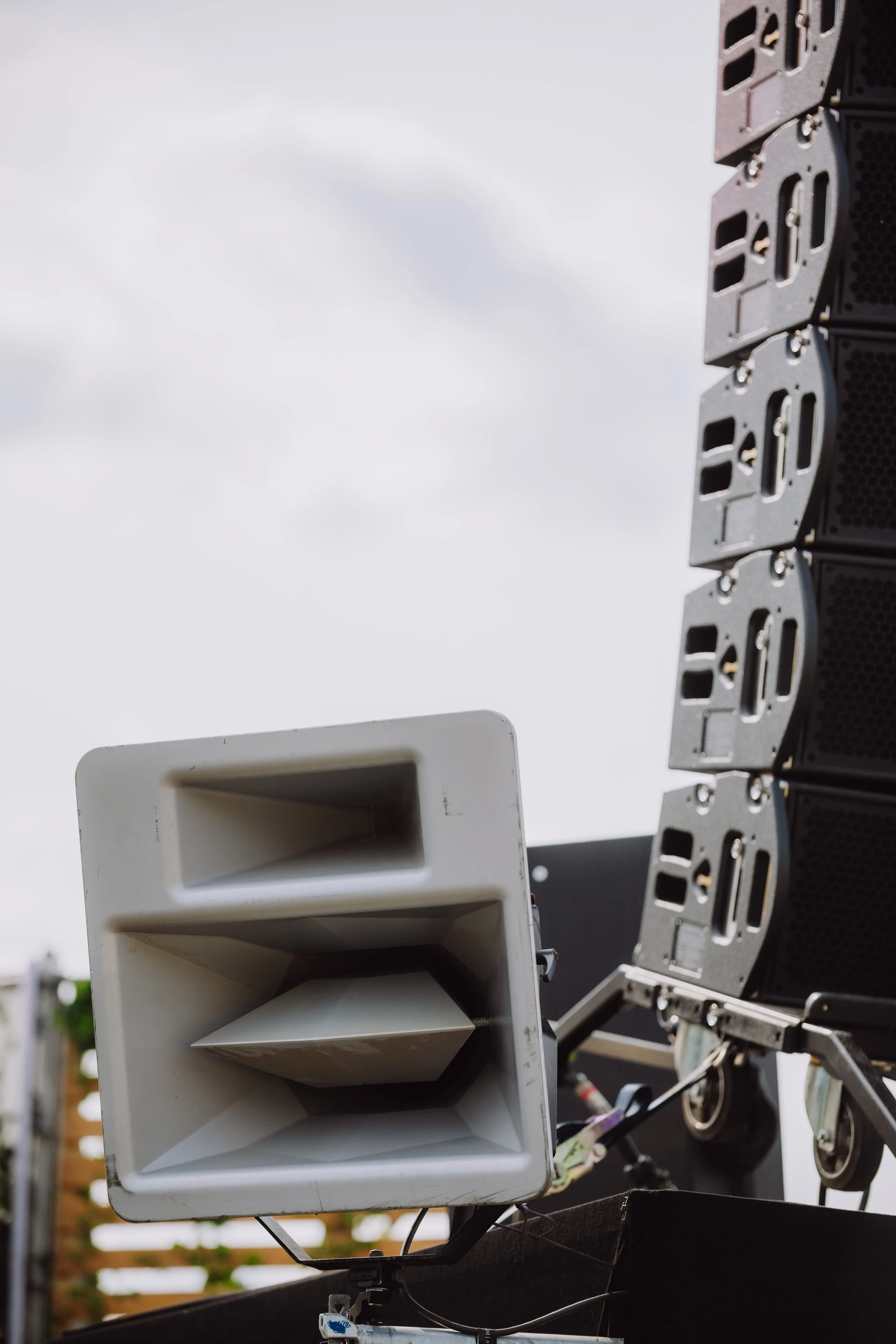
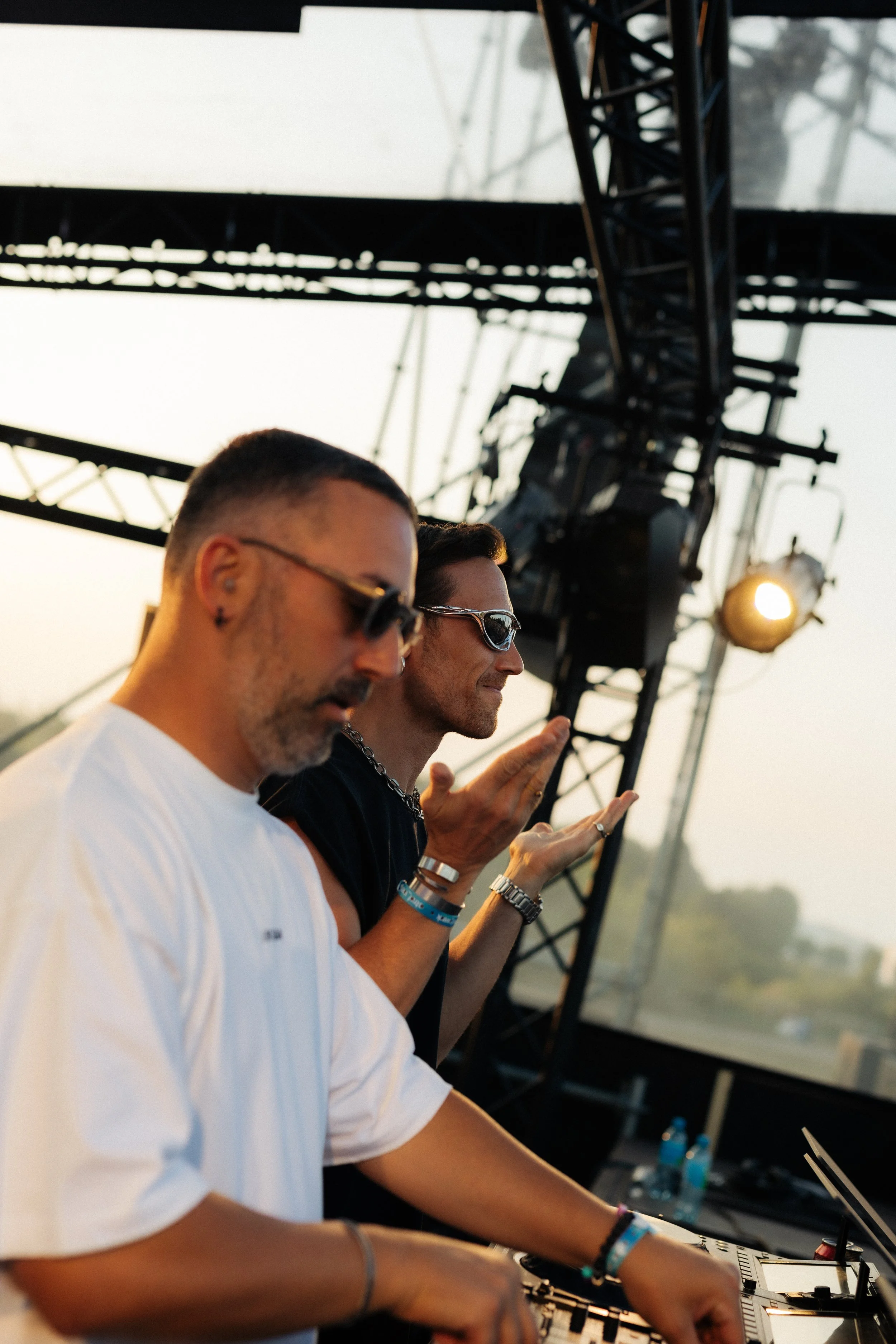
I also provided art direction for festival photography — setting the mood through visual research, moodboards, and shot concepts — and handled hands-on design work for assets like line-ups, fencing, and signage.
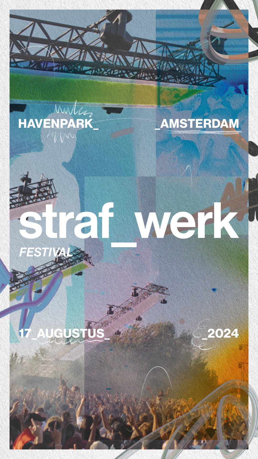
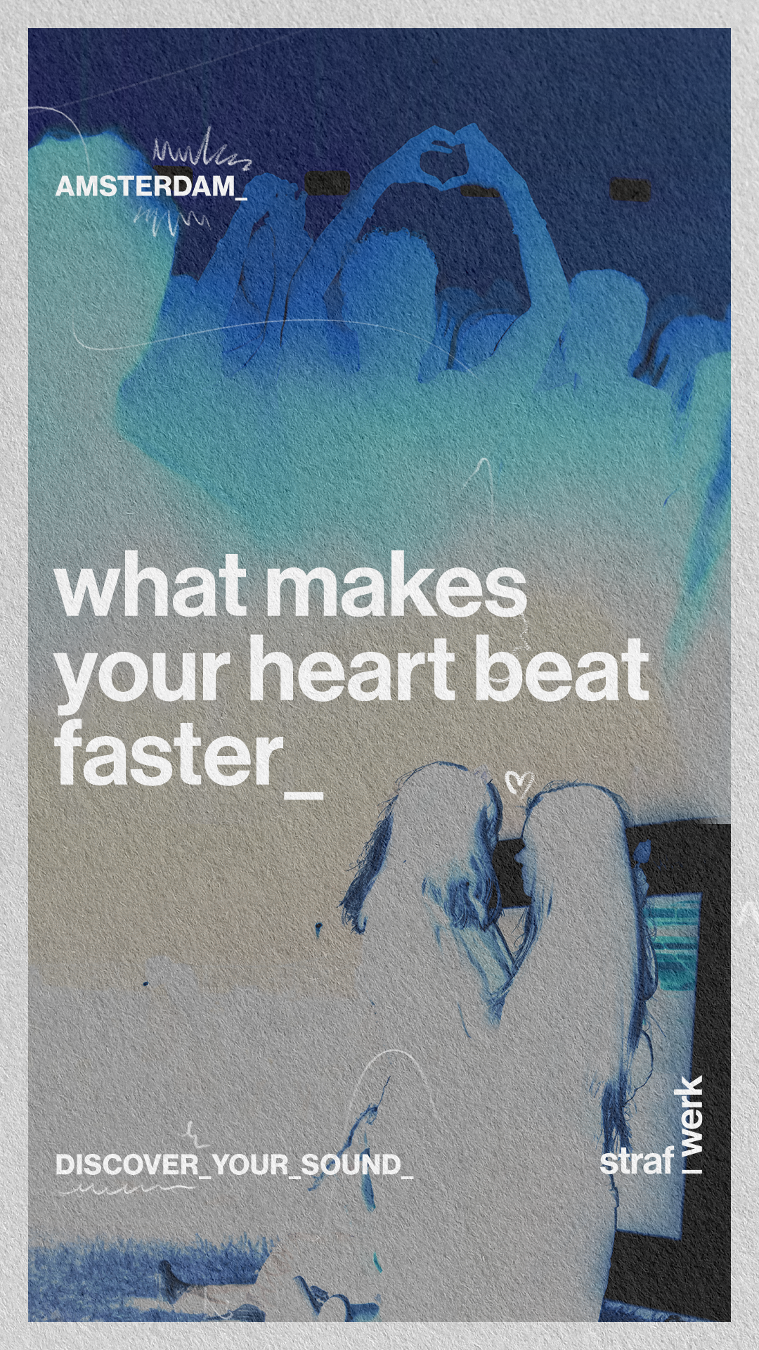
The new straf_werk is about a very specific stage of life: the messy, in-between phase of becoming an adult.
You’re living in your first apartment — half Ikea, half secondhand finds. You’re surrounded by mismatched furniture, half-finished ideas, and people who might become lifelong friends or just part of one summer.
You’re still figuring things out: what you like, who you want to be, where you belong. And at night, that exploration spills out into the city — into clubs, festivals, and crowded dance floors. That’s where straf_werk exists: in the blur between identity and nightlife.
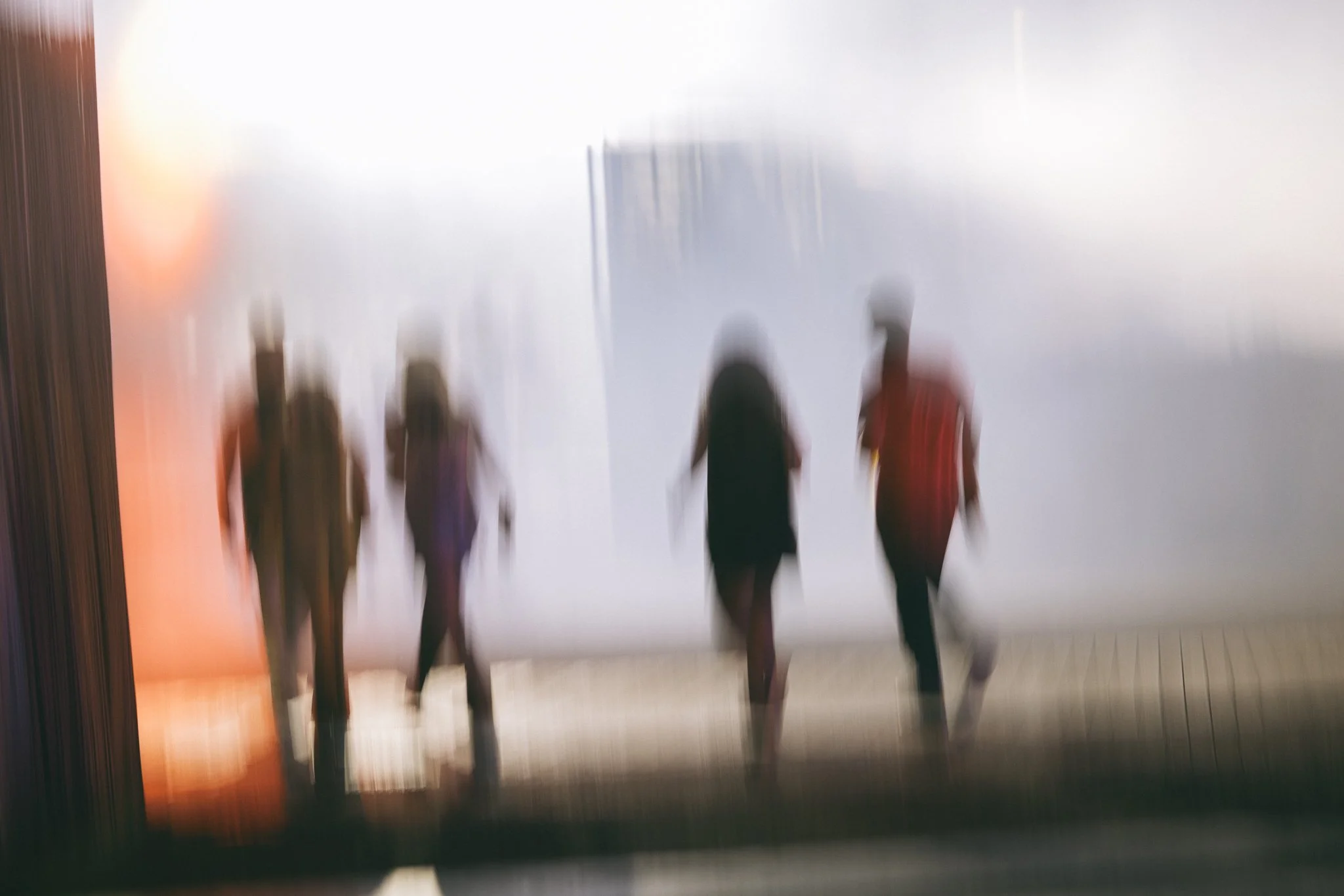
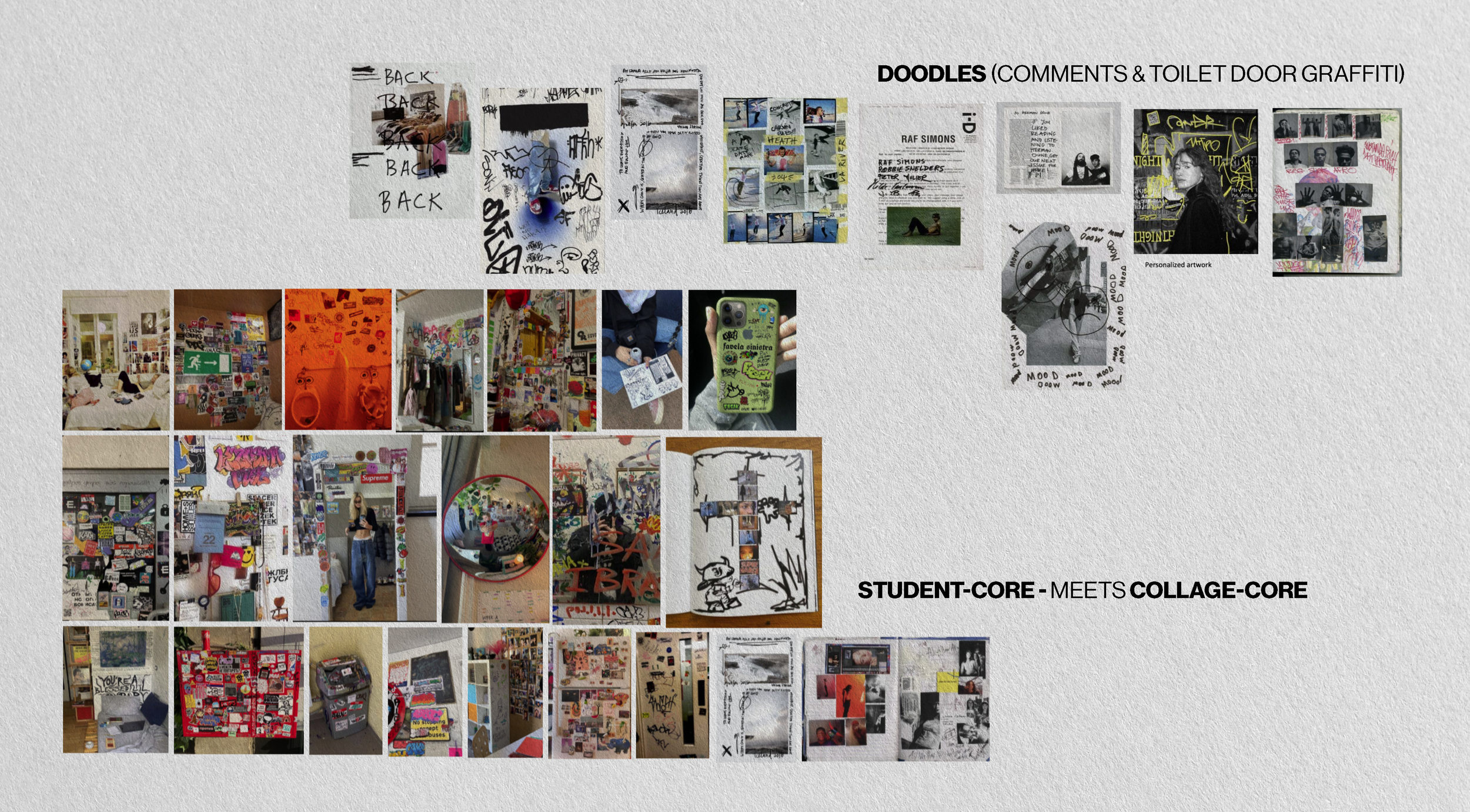
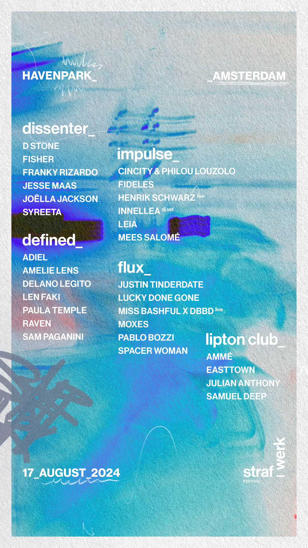
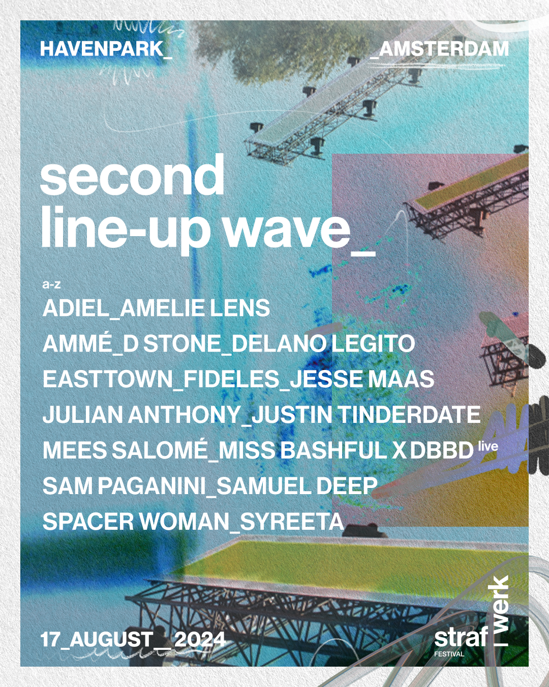
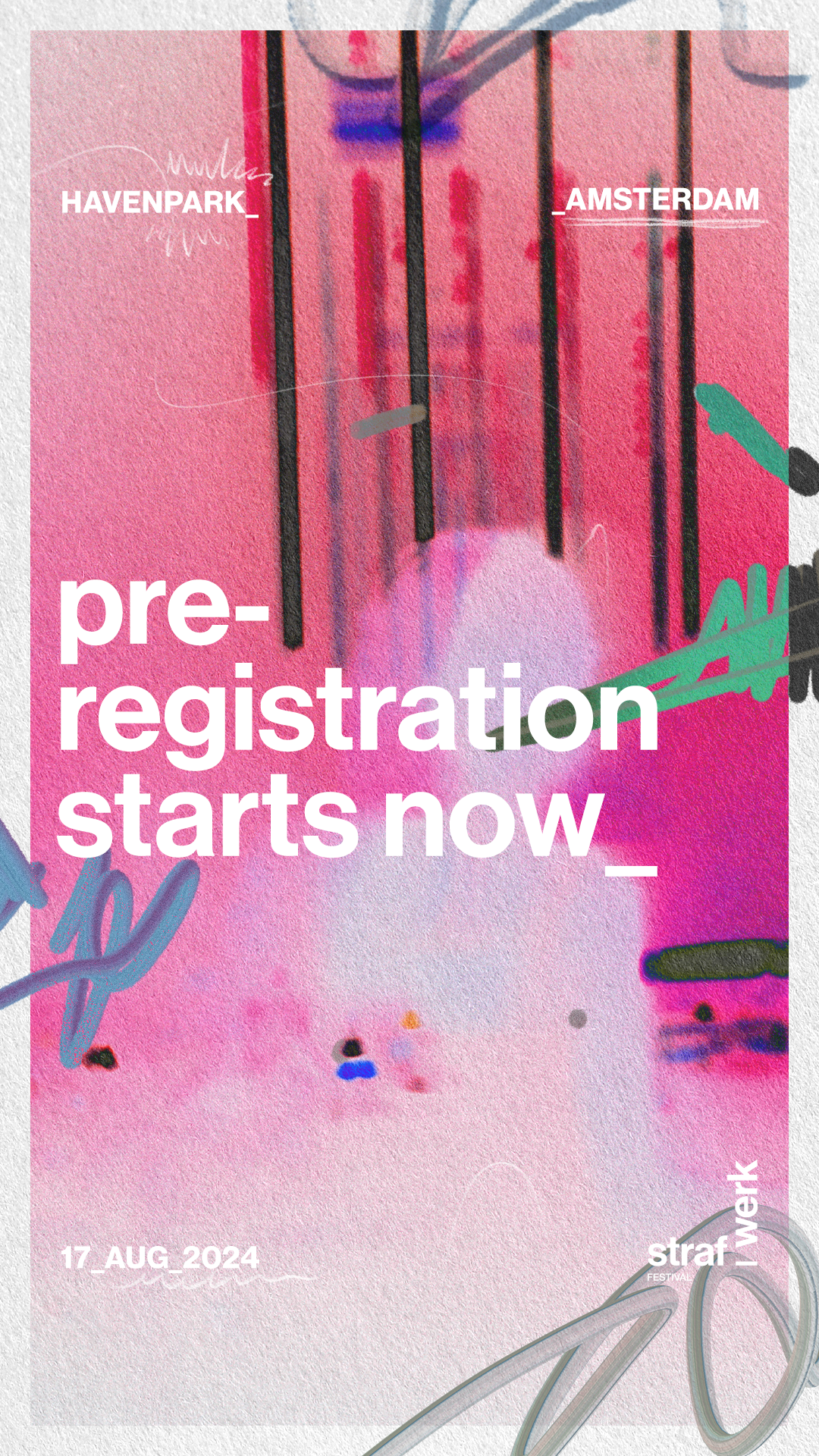
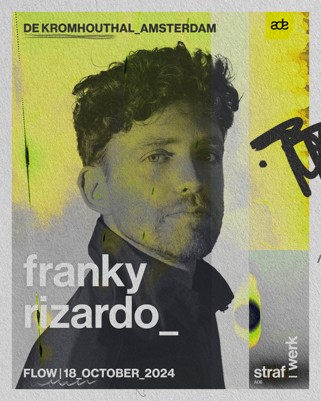
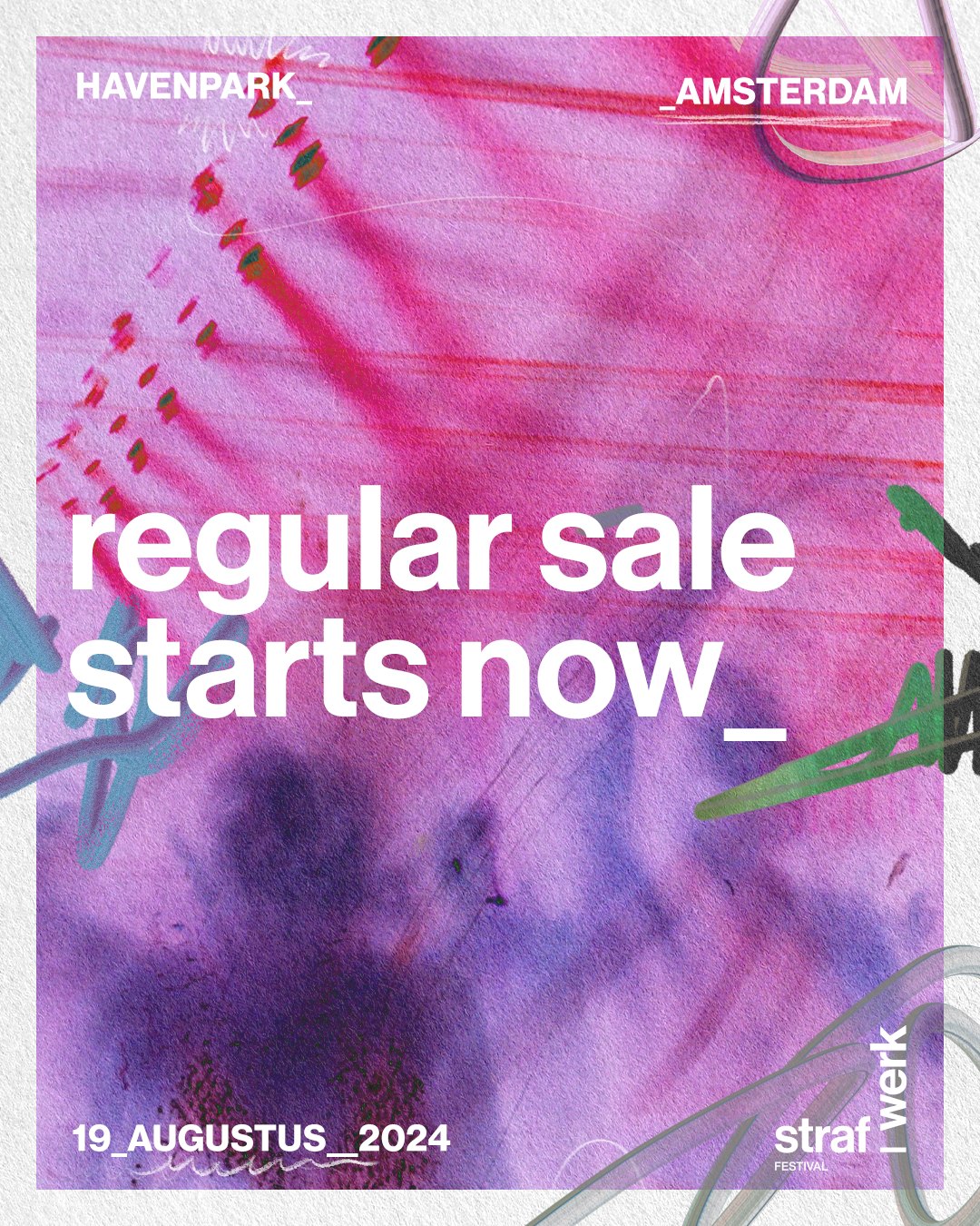
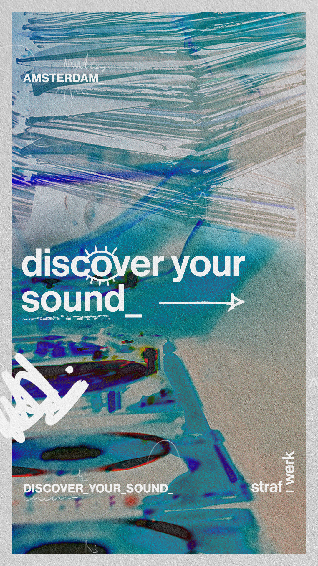
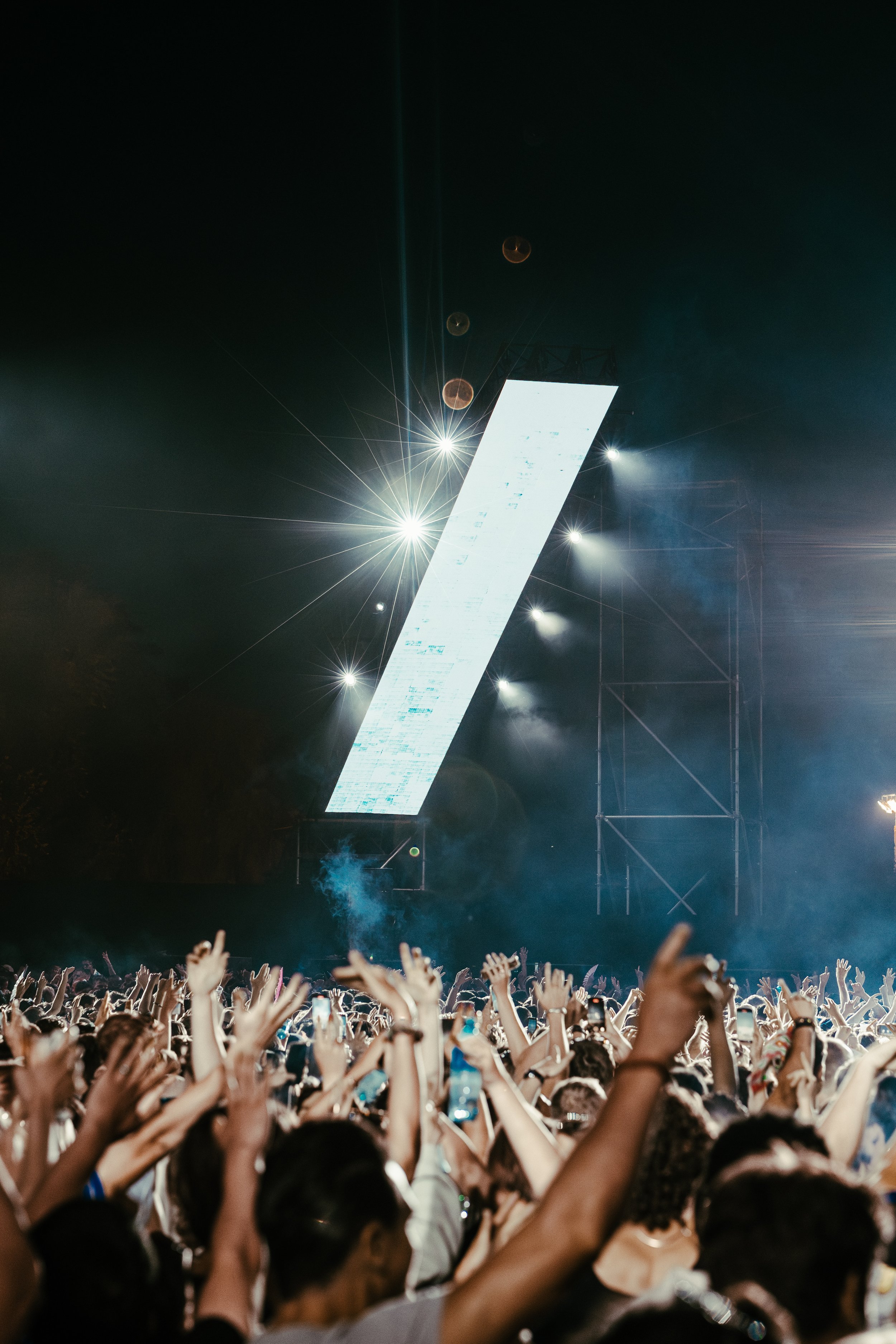
The brand embraces that feeling through rough textures, layered compositions, and photography that feels impulsive and real. Nothing polished, nothing overly designed — more like a wall of collected moments, taped together from nights that shaped you.
Each year, the look can shift slightly, reflecting changes in culture and youth aesthetics, but the foundation stays the same: straf_werk celebrates imperfection, experimentation, and the raw energy of figuring yourself out.
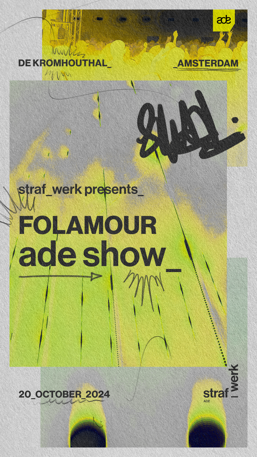
To make sure the system could live beyond my involvement, I designed templates so that marketers and content creators could easily build within the same visual language.
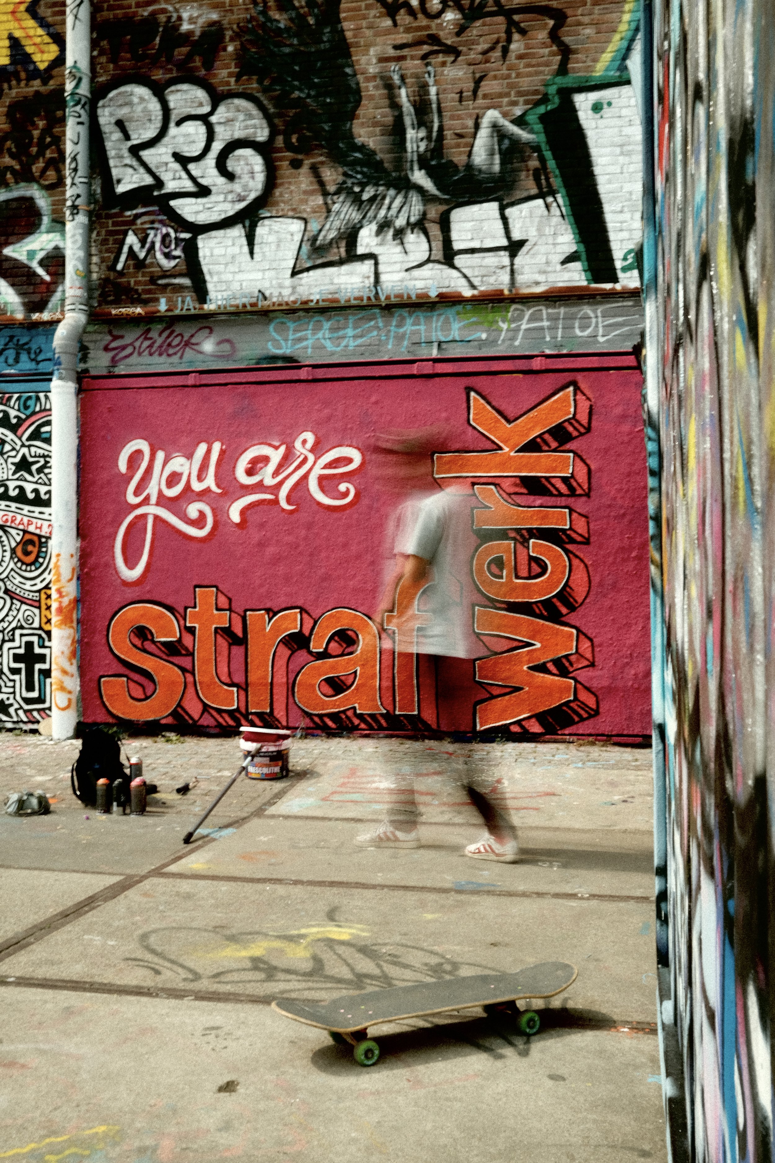
Part of the rebrand was the concept “you are straf_werk” — an idea that blurred the line between the audience and the brand, making the community not just part of the experience, but part of the identity itself.

Case Overview_
straf_werk is a well-known Amsterdam-based house and techno festival that, over time, had drifted away from the raw, provocative identity it once had. What started as a bold and rebellious brand had slowly turned into something minimal and trend-driven, until very little of its original character was left.
The goal of this rebrand was to bring back that edge — not by recreating the past, but by connecting it to the reality of a new generation. A generation standing at the crossroads of youth and adulthood, figuring out who they are, and finding freedom in the night
The Concept_


email template’s
artdirection & concepts onsight_
moodboard art-direction onsight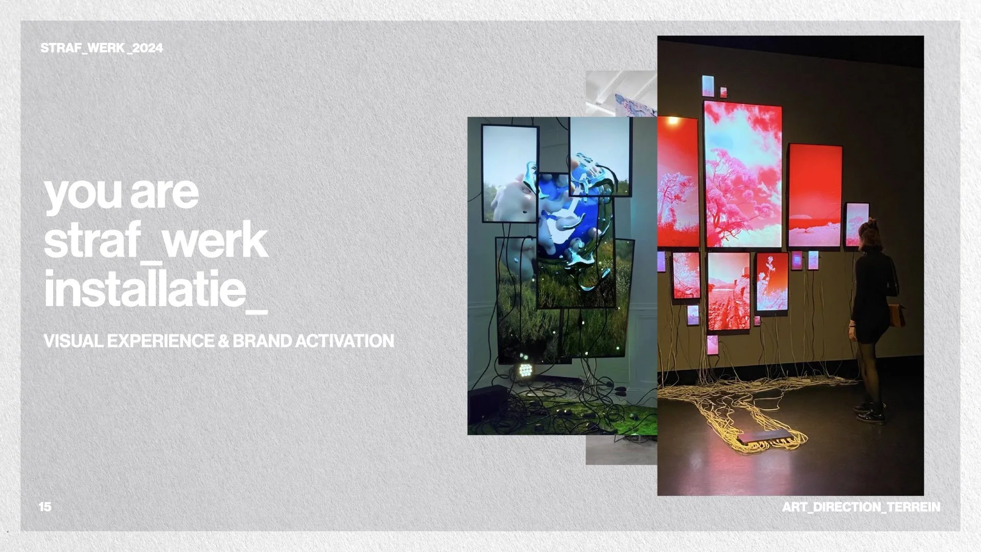
From this research and early ideation came the foundation of you_are_straf_werk.
At that stage, it wasn’t an installation yet, but rather a conceptual direction: the idea that the visitor is not just an observer, but the muse — the core visual identity of the brand.
When presenting these concepts internally, the team immediately recognized the potential of this idea. Not only did it align with earlier projects like our Lipton DJ contest, it was also something we had the space and budget to execute for the upcoming festival. That made it the most realistic next step in bringing the rebrand to life.
We launched an open call for makers, inviting creators to develop small-scale artworks for the festival grounds that embodied this idea of the visitor as muse.
Two artists were selected — and what made their involvement remarkable is how closely their style and thinking matched my original moodboard. Almost uncannily. Their aesthetic aligned so naturally with the visual direction I had mapped out that their work became a perfect extension of the brand:
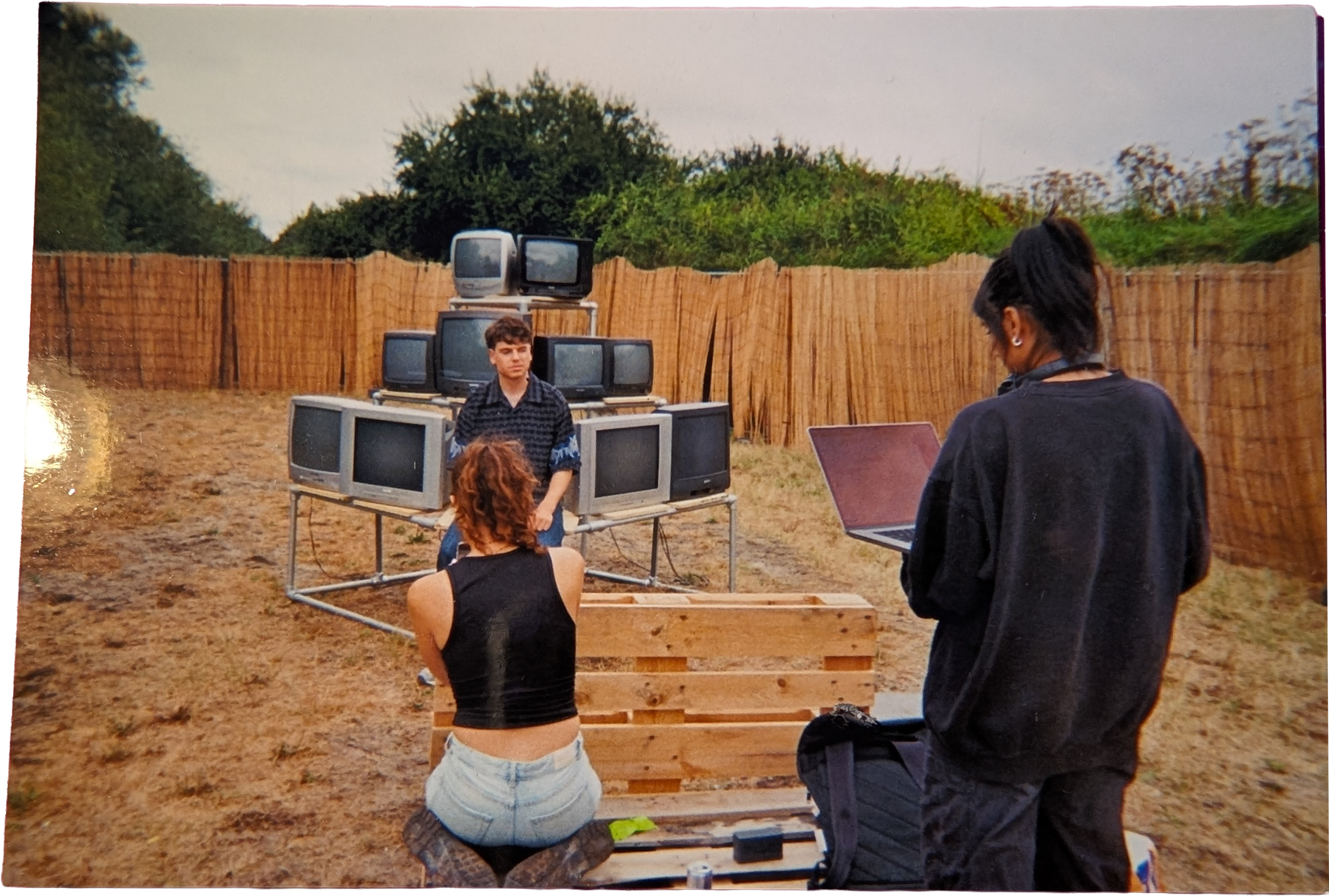
One developed an audiovisual installation using vintage televisions reacting to the surrounding soundscape.
The other created an interactive place-making environment translating the concept into a lived, communal space.
We documented their creative process through mini-docs and shared the videos across our socials, giving them visibility and integrating the community into the identity-building of straf_werk.
you_are straf_werk
Concept DevelopmentWhen we entered the first year of the rebrand, we knew it wasn’t realistic to redesign entire festival stages straight away. Budget-wise, the focus had to be on subtle but meaningful interventions — elements that could sit between stages yet still communicate the identity of straf_werk in an impactful way.
So I built a moodboard specifically around these constraints: small-scale, achievable ideas that could transform the festival grounds without requiring major construction.
While exploring this direction, several concepts emerged:
gidion's art_intallationIn the end, you_are_straf_werk became a bridge between conceptual vision and achievable reality — a way to express the new identity through community-driven creativity, even within tight production limits. It turned the festival grounds into a space where visitors could literally and symbolically shape the brand.
you_are_art - mini docu RebeccaRebecca's art-installation - final outcomeRebecca’s placemakingyou _ are _ straf_werk_dj_contestyou _ are _ straf_werk announcement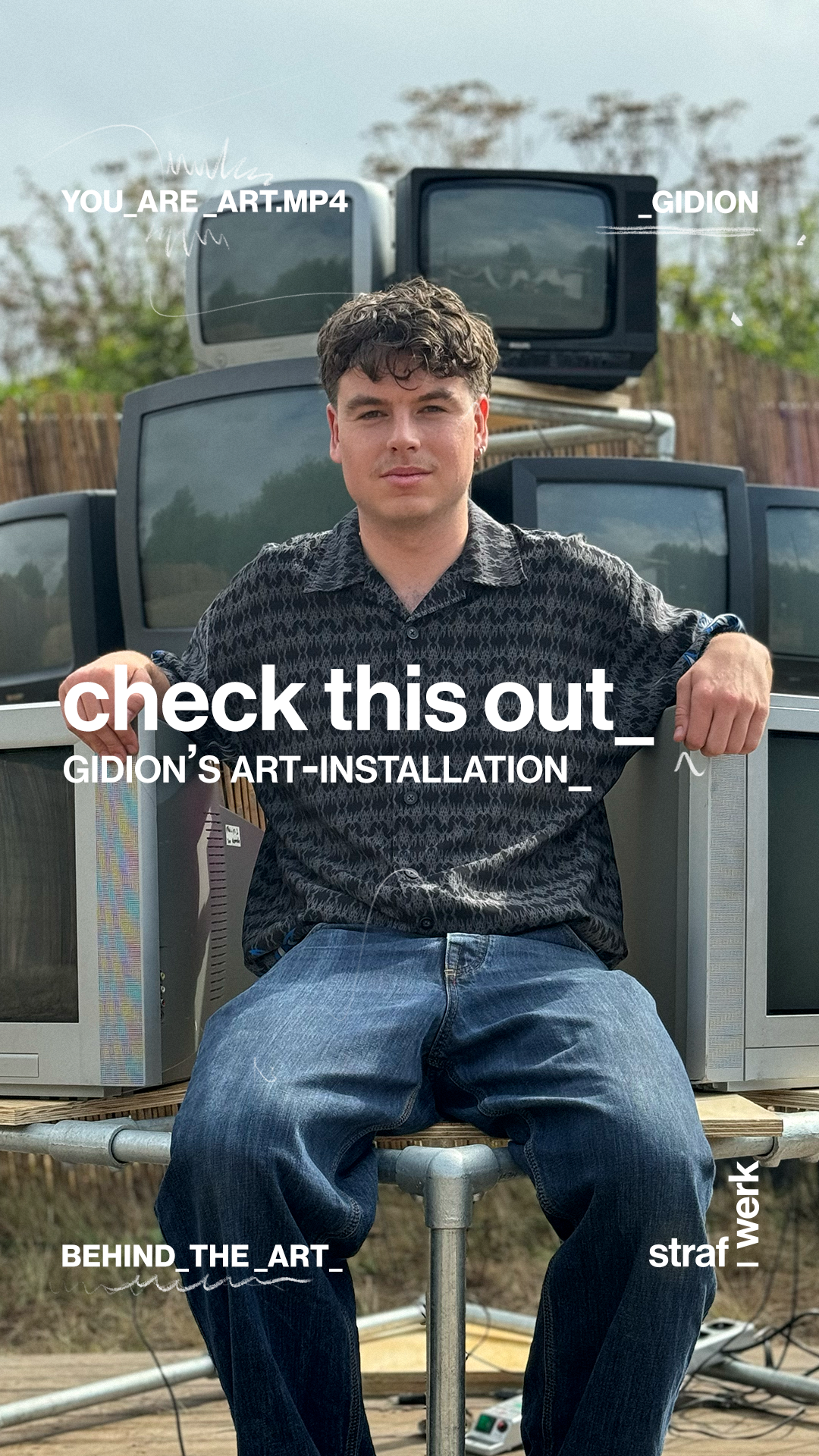
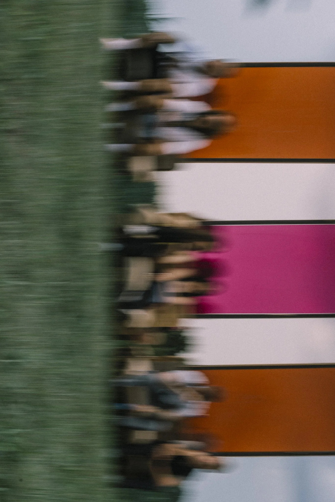
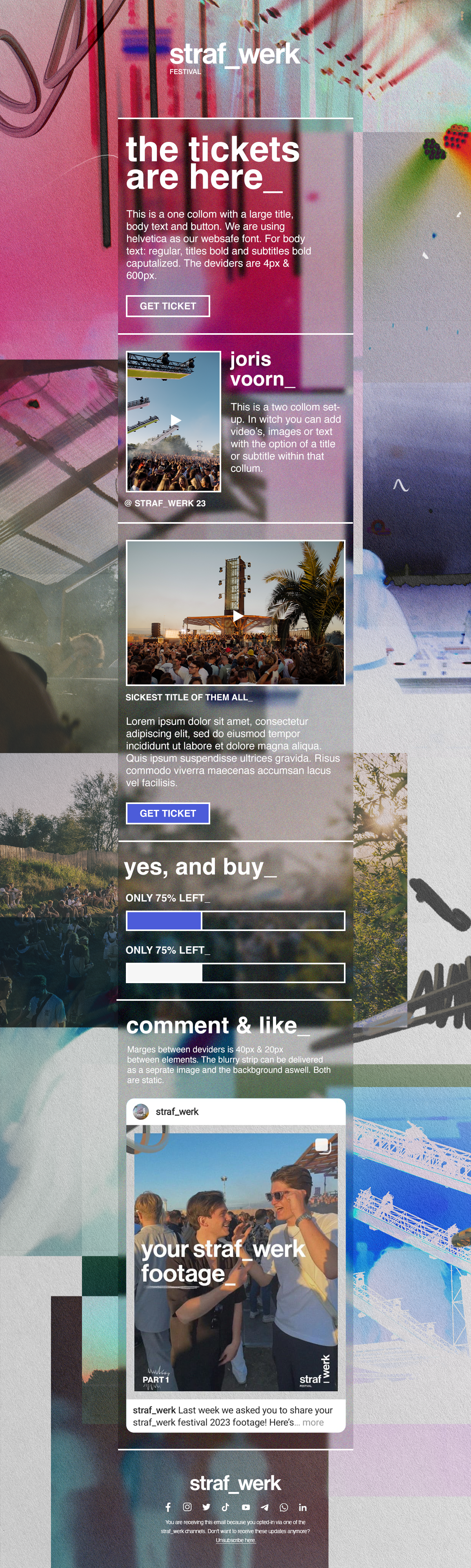
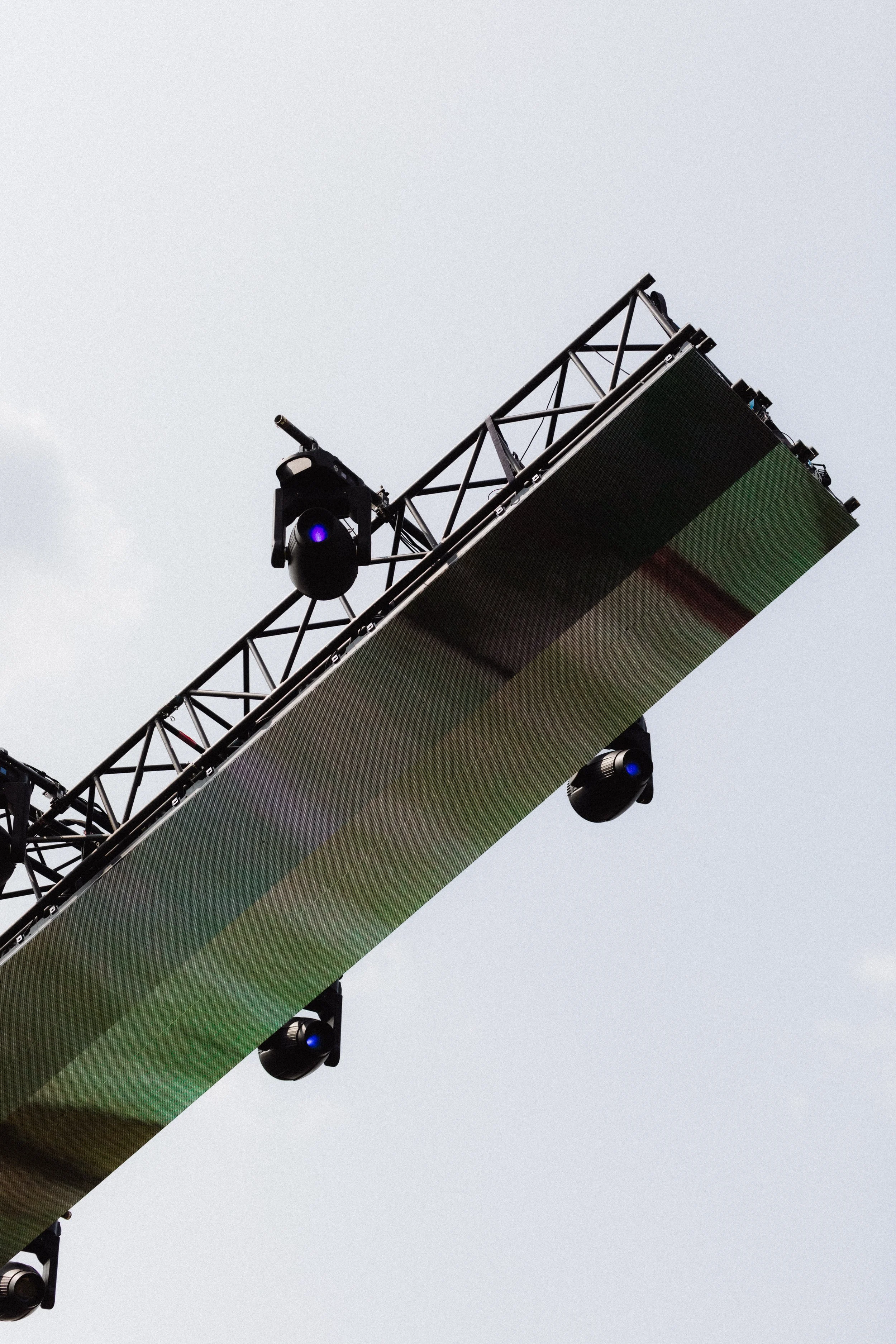
bannering Bannering designed to merge with the environment and adapt to yearly artwork refreshes
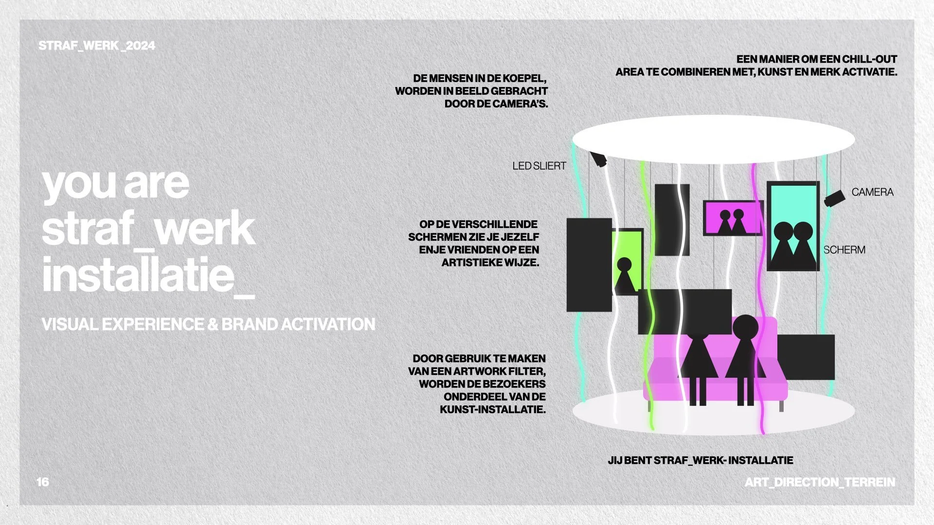
An installation built from lights or screens, potentially in partnership with a tech brand, where visitors would become part of a visual collage — blending into the layered aesthetic I created for the rebrand.
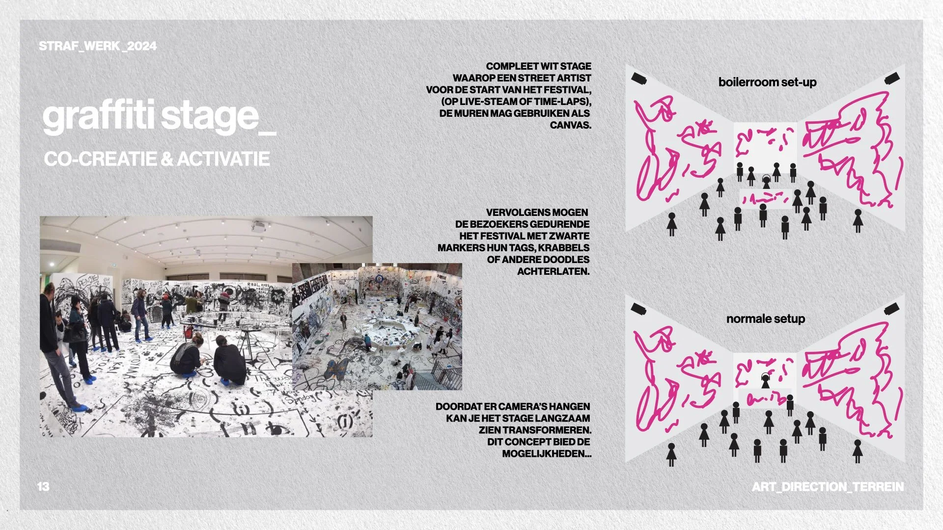
A fully white “graffiti stage”, where visitors could tag the walls with markers throughout the set — a live transformation from clean to chaotic, similar to the energy of a club bathroom.
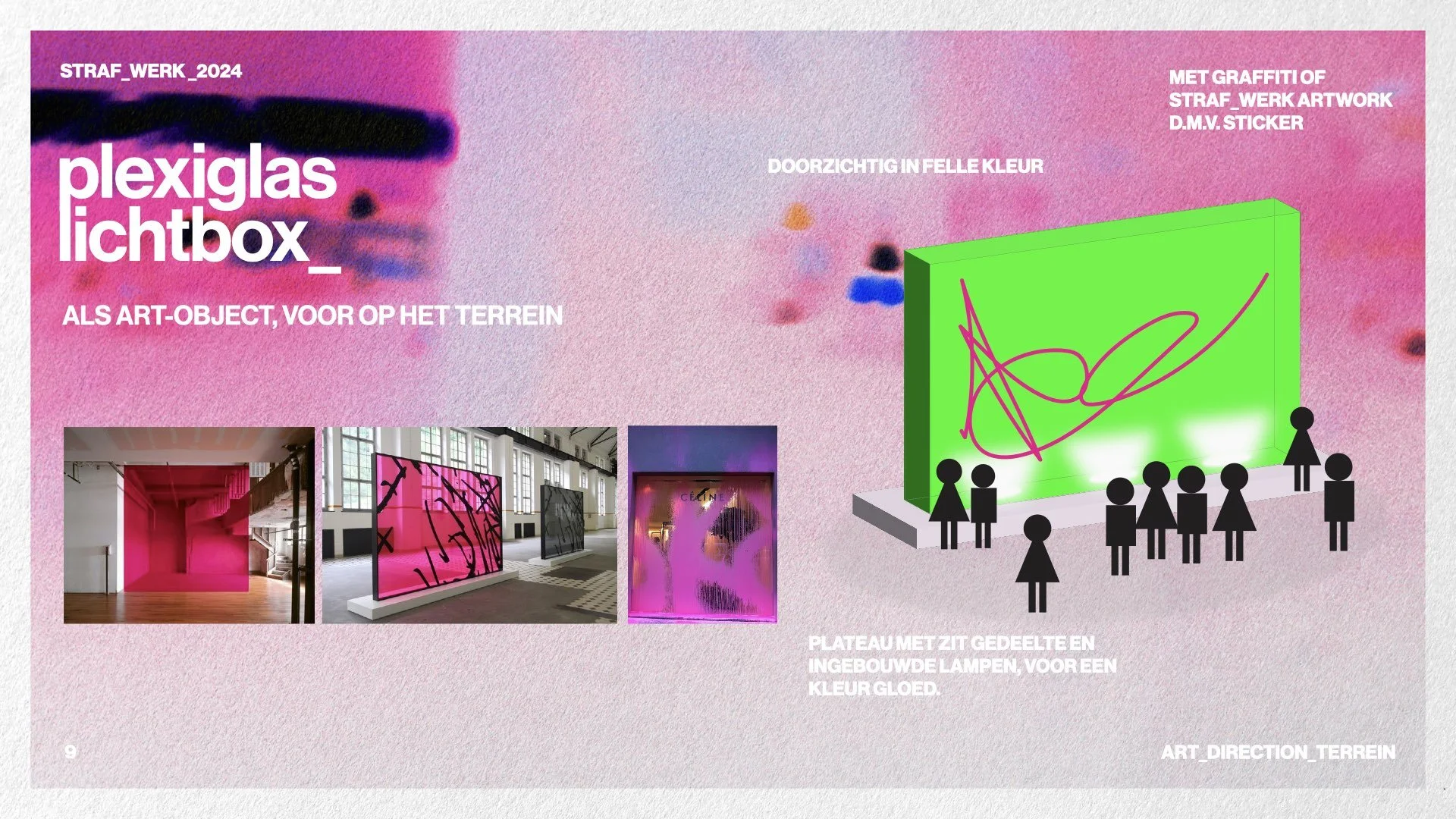
Colorful plexiglass light boxes with seating, sprayed with graphic elements — functional installations that doubled as strong photo moments.
From this research and early ideation came the foundation of


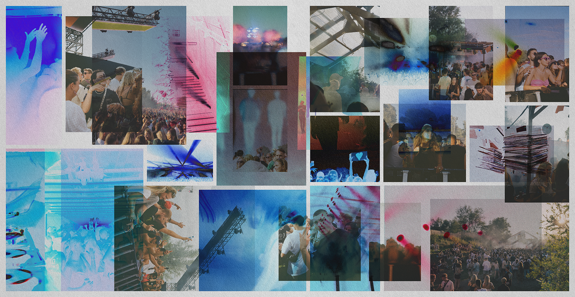
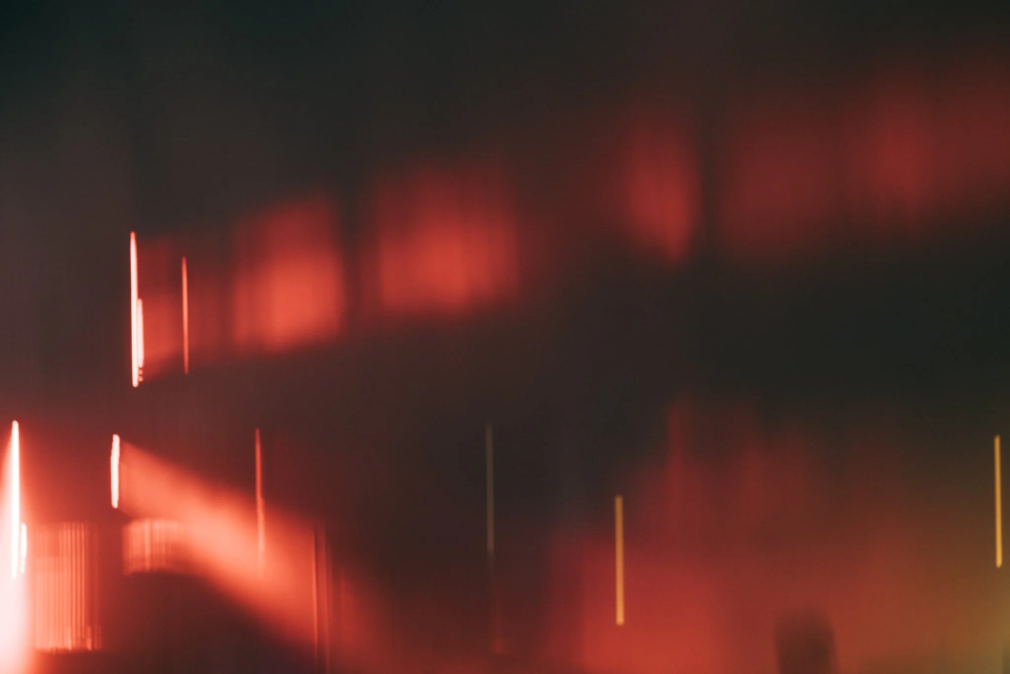
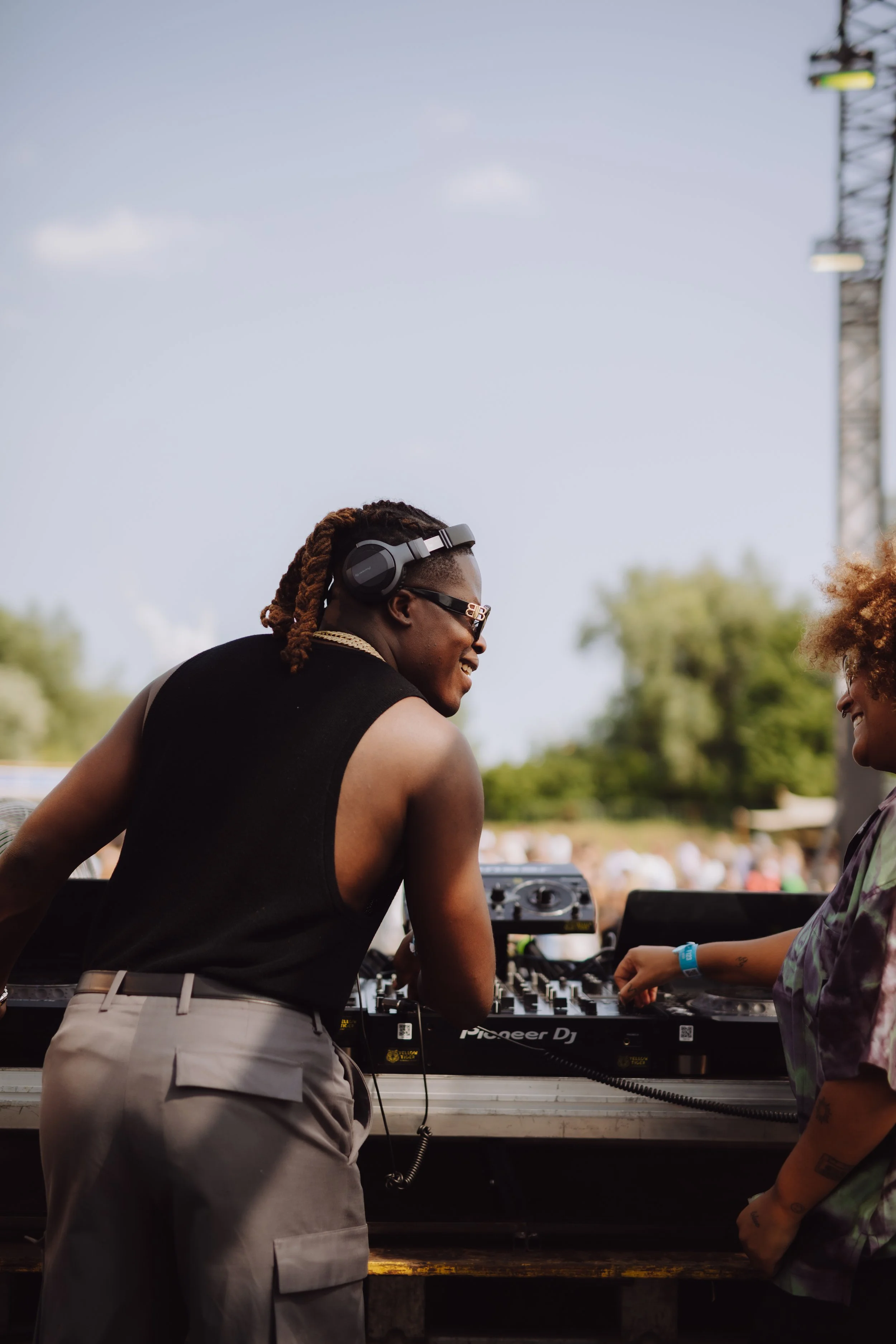
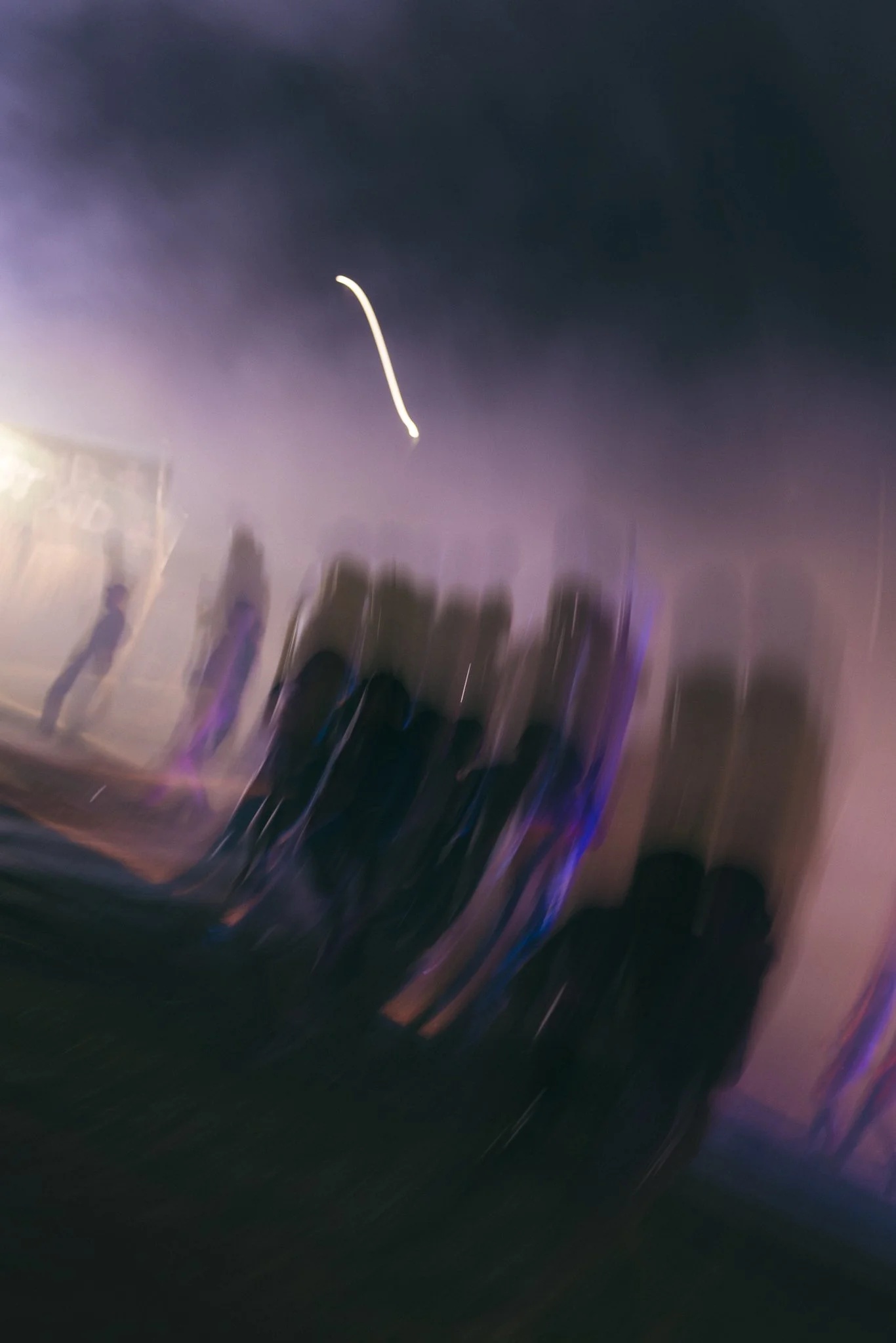
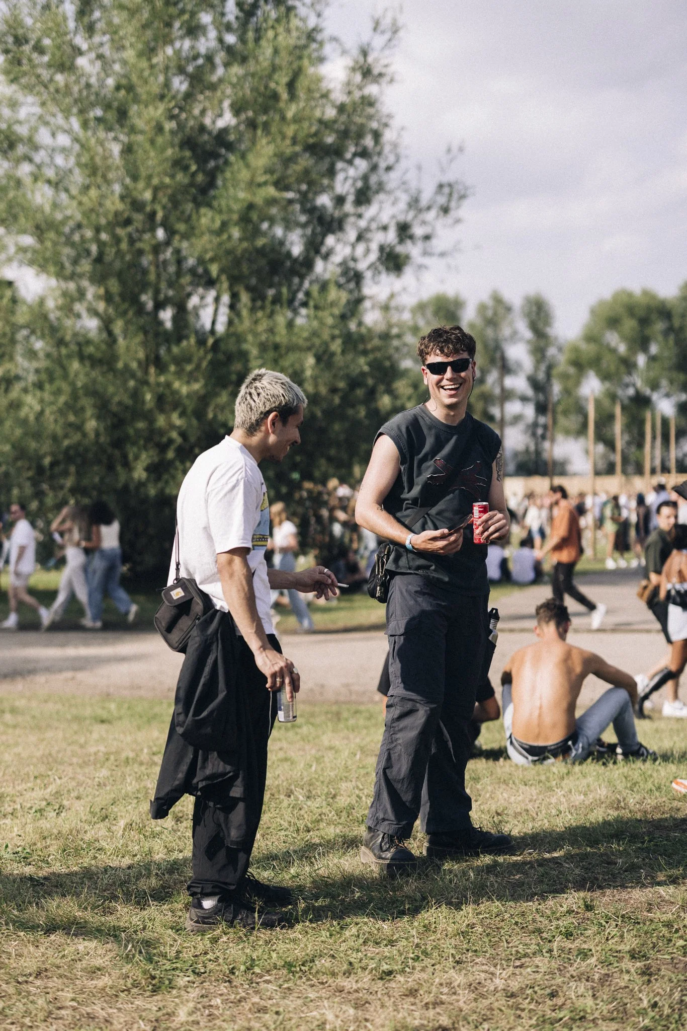
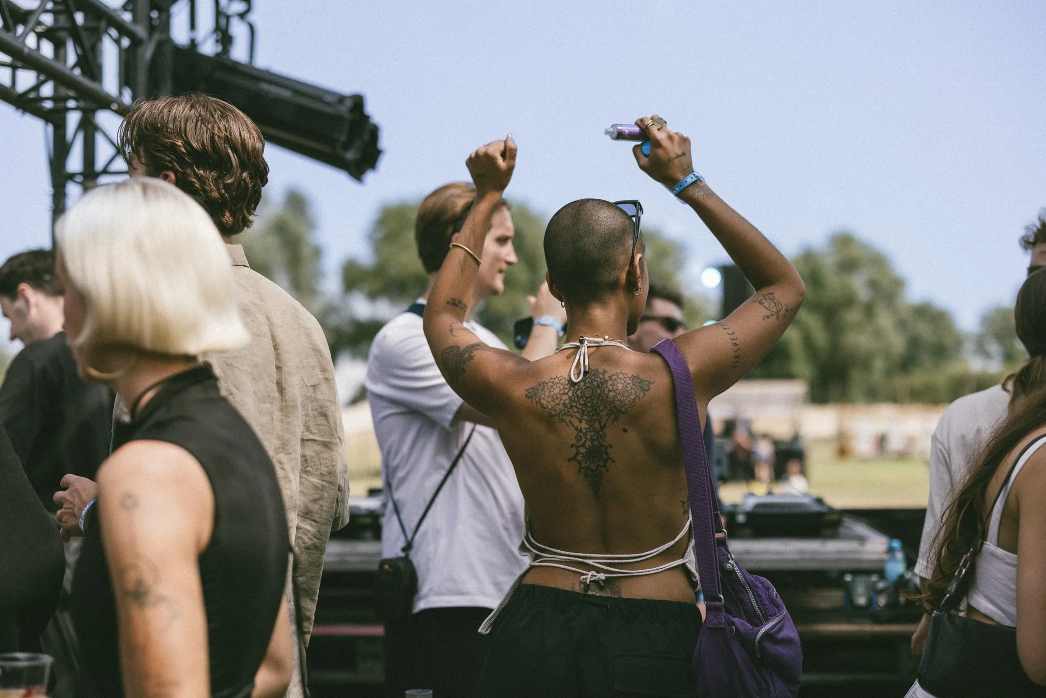
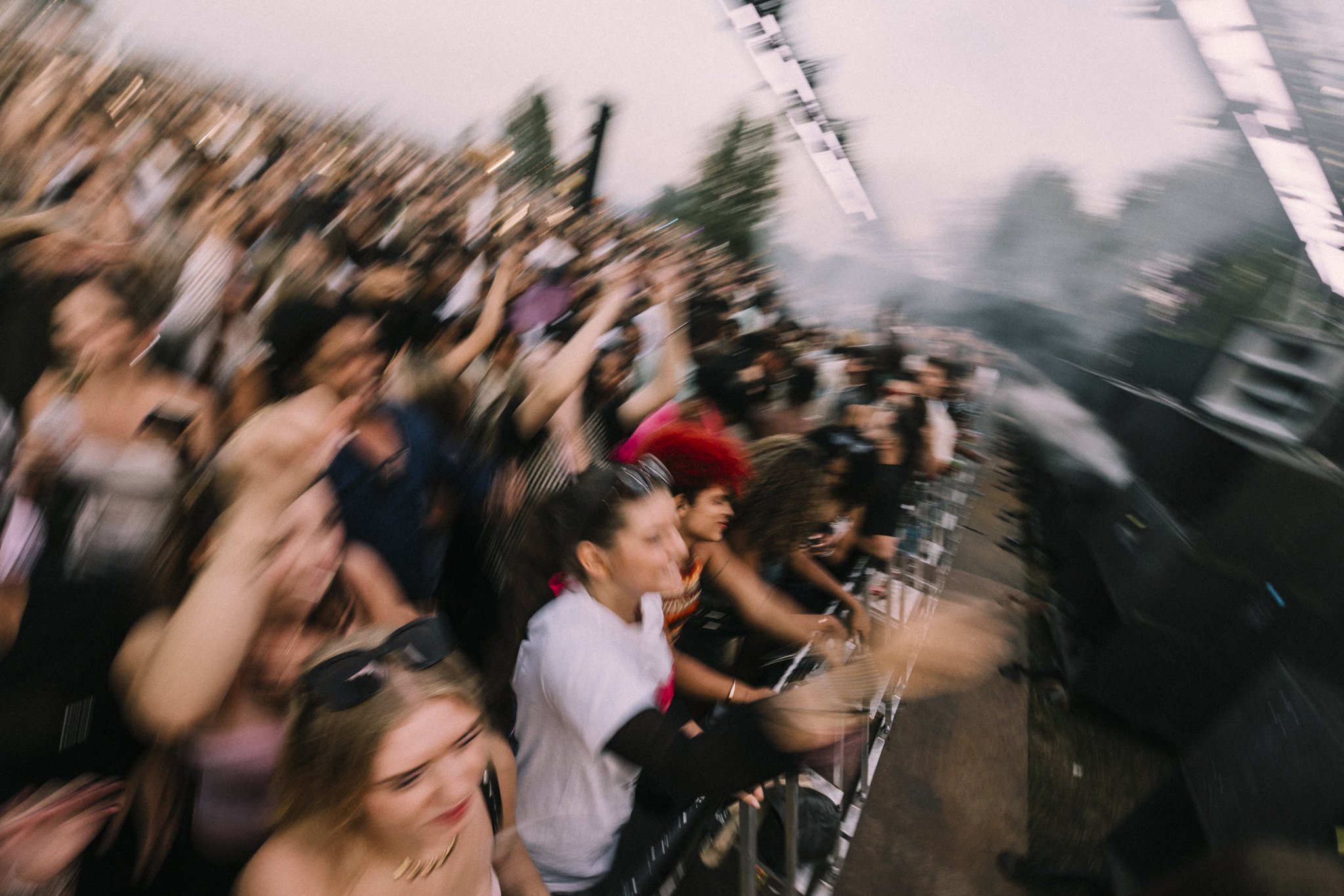
photography art direction
Because the brand does not only use the photography for telling it’s story in our communication online. I also used it as a part of the artworks. The moodboards you see here try to cover both use cases.

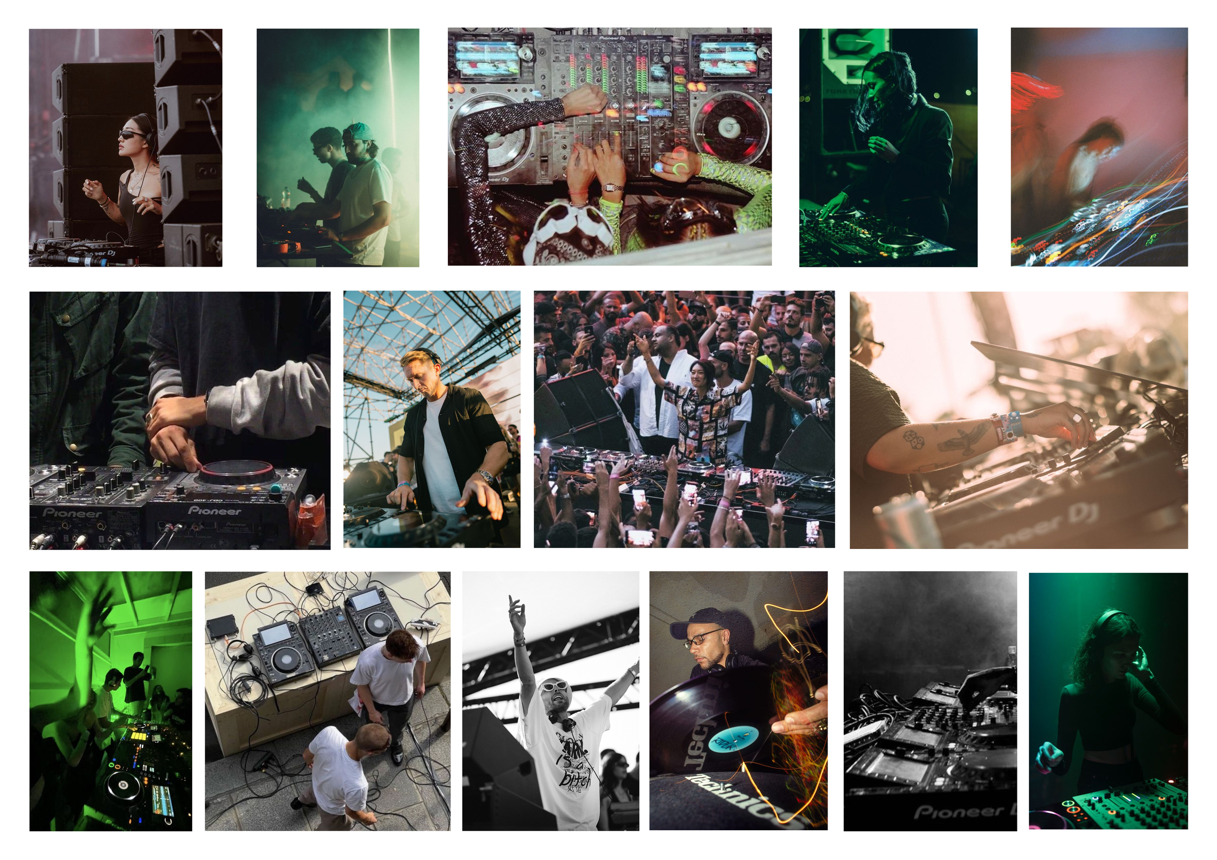
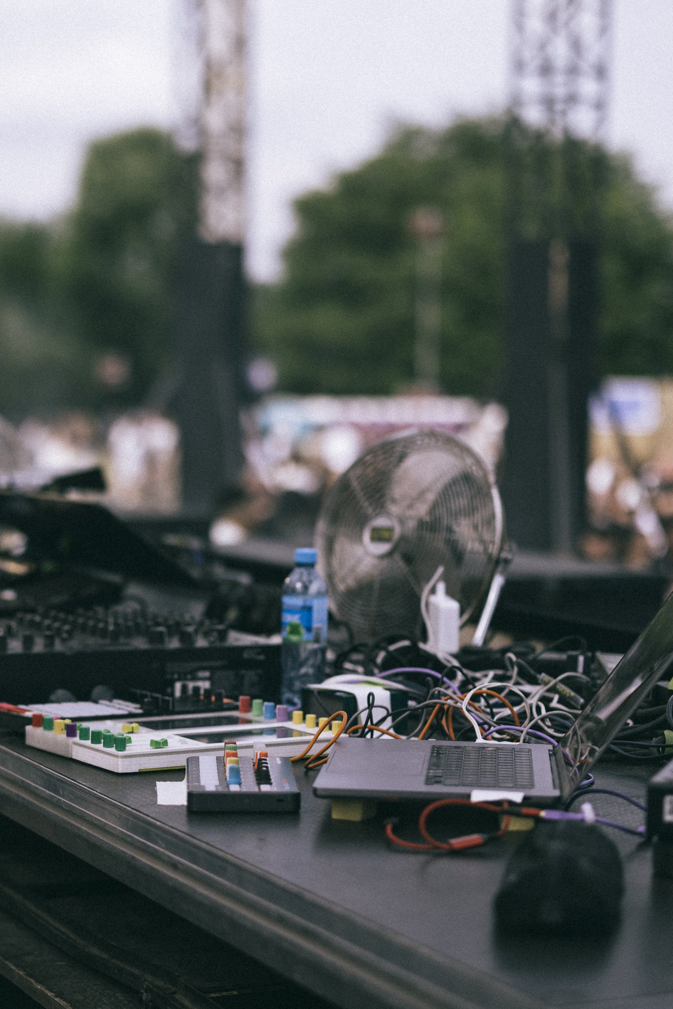
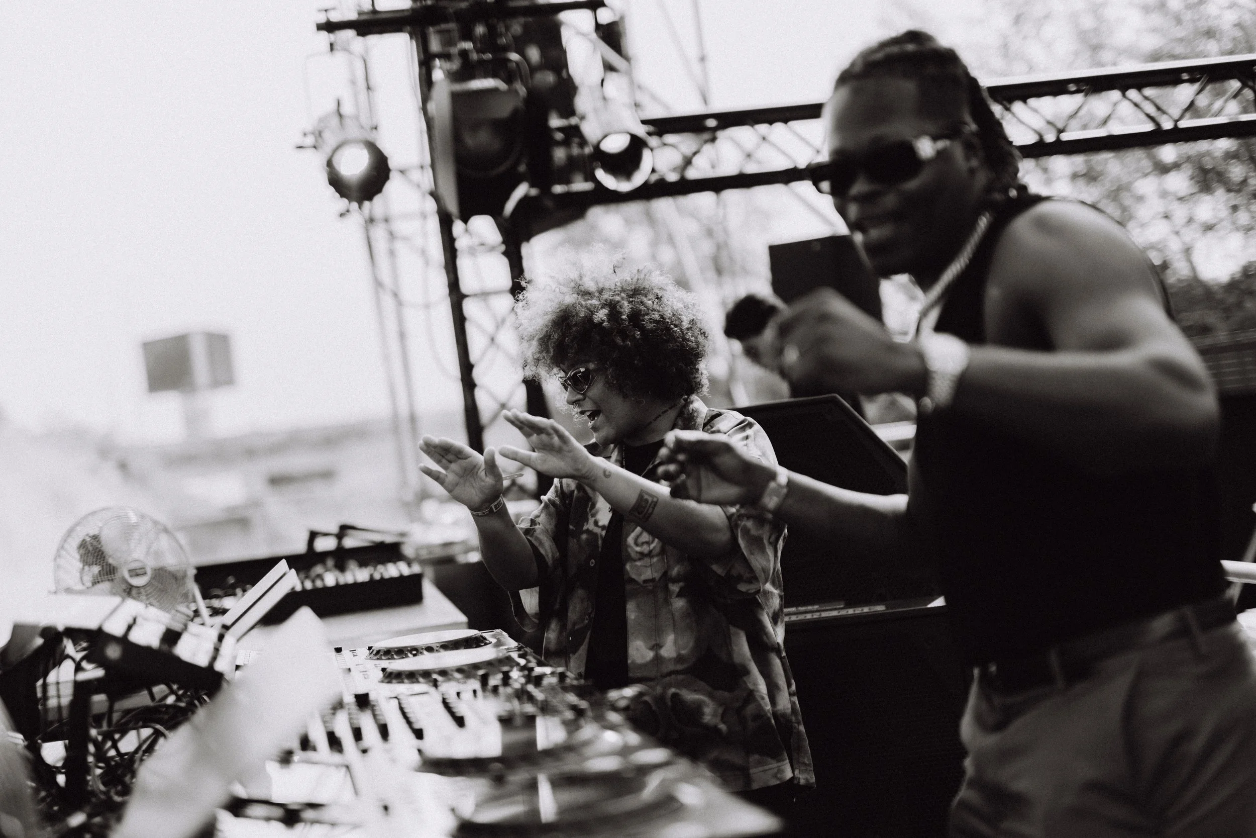
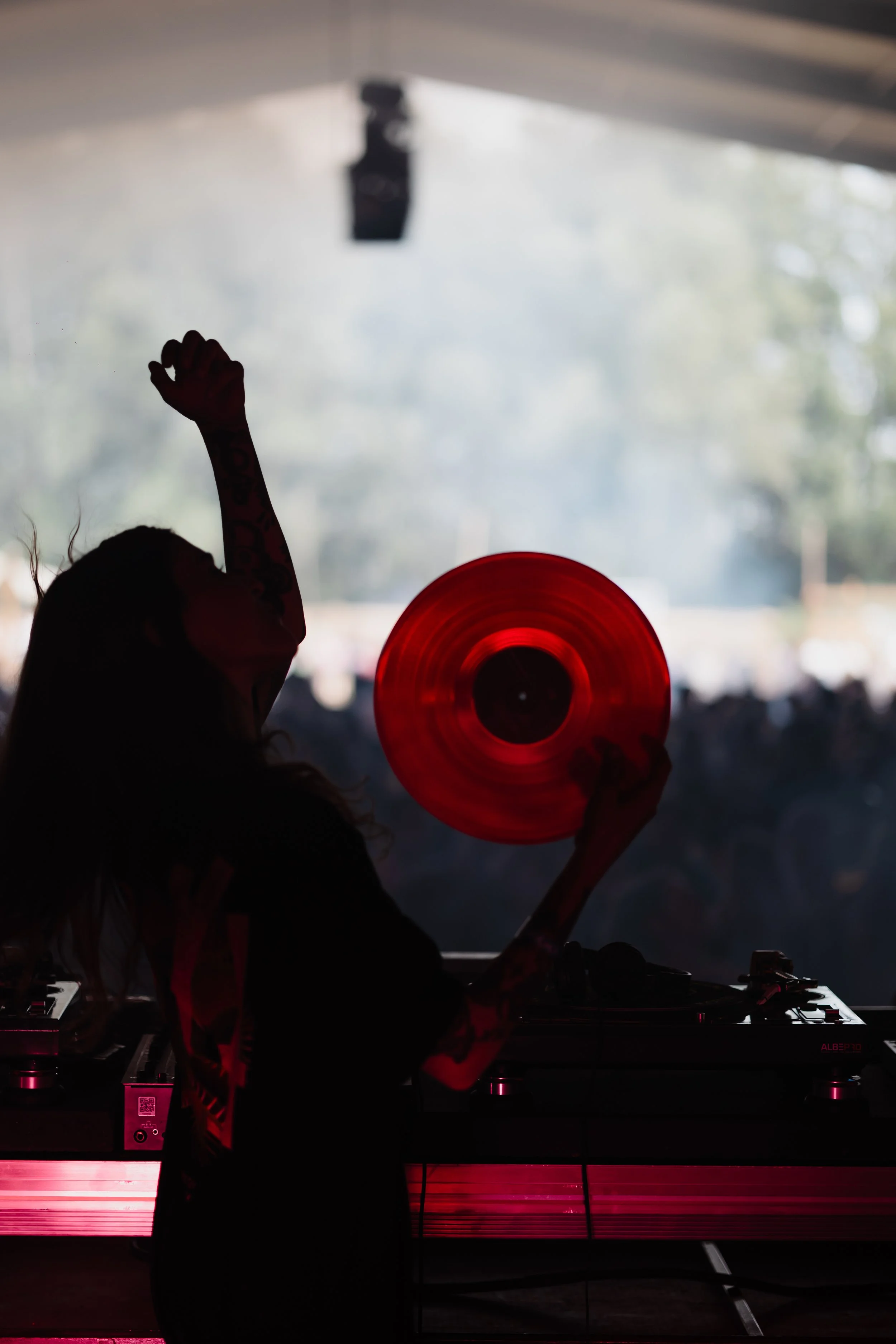
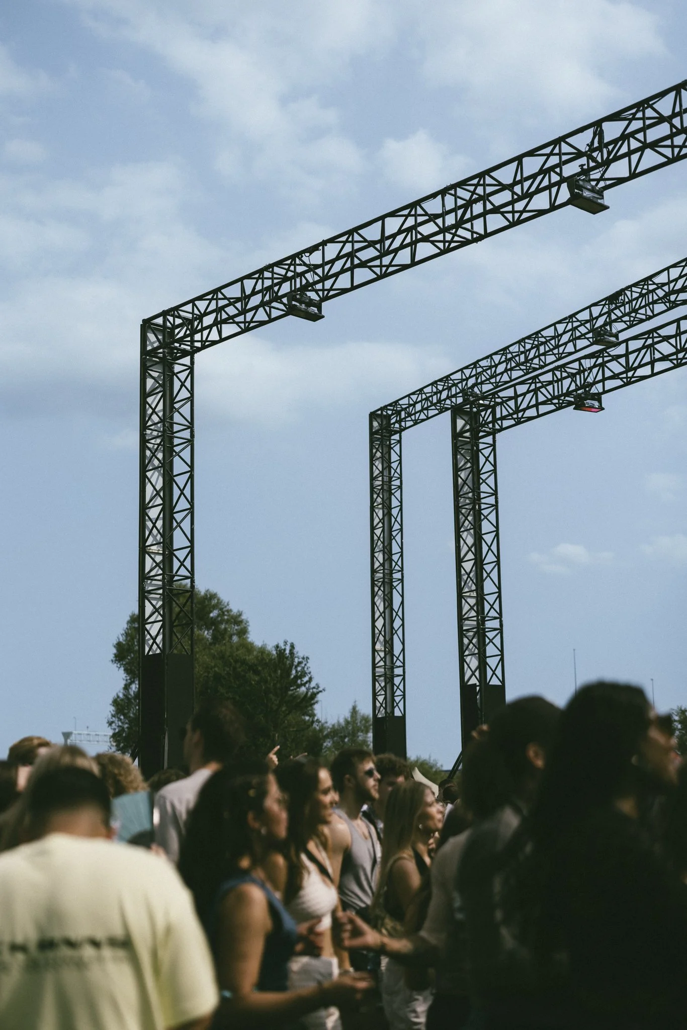
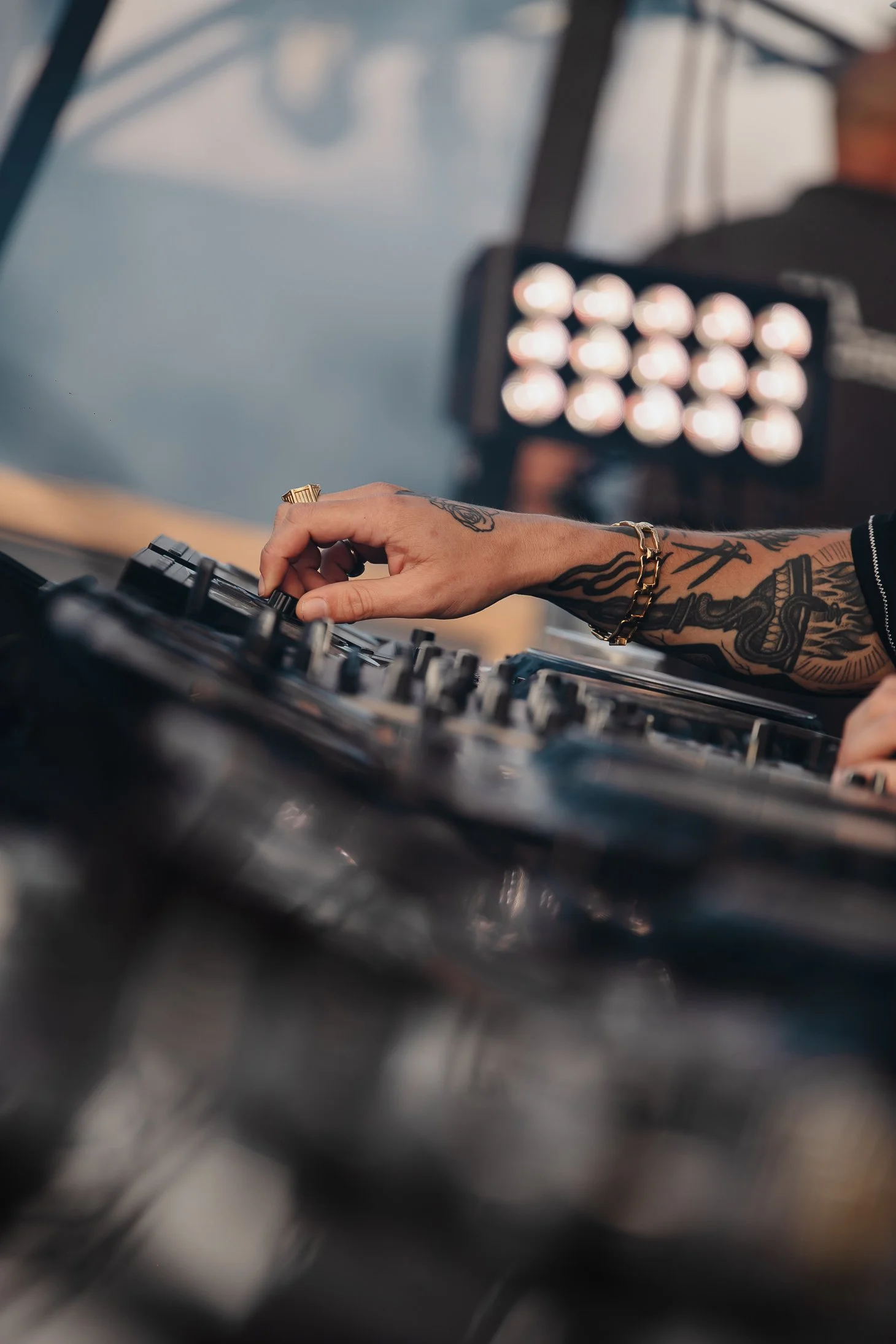
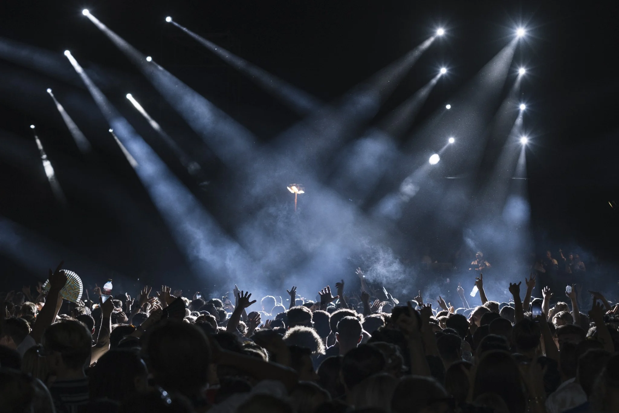
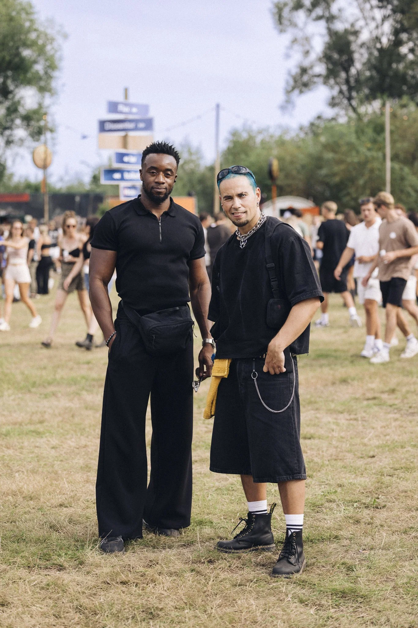
daytime & Nightime, dj's, detail shots of craftmenship
a few of my favorite shots daytime, crowds, detail shots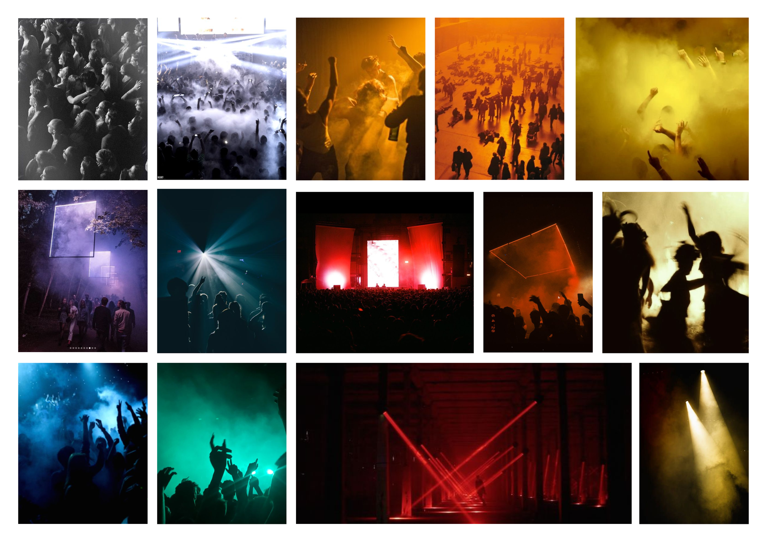
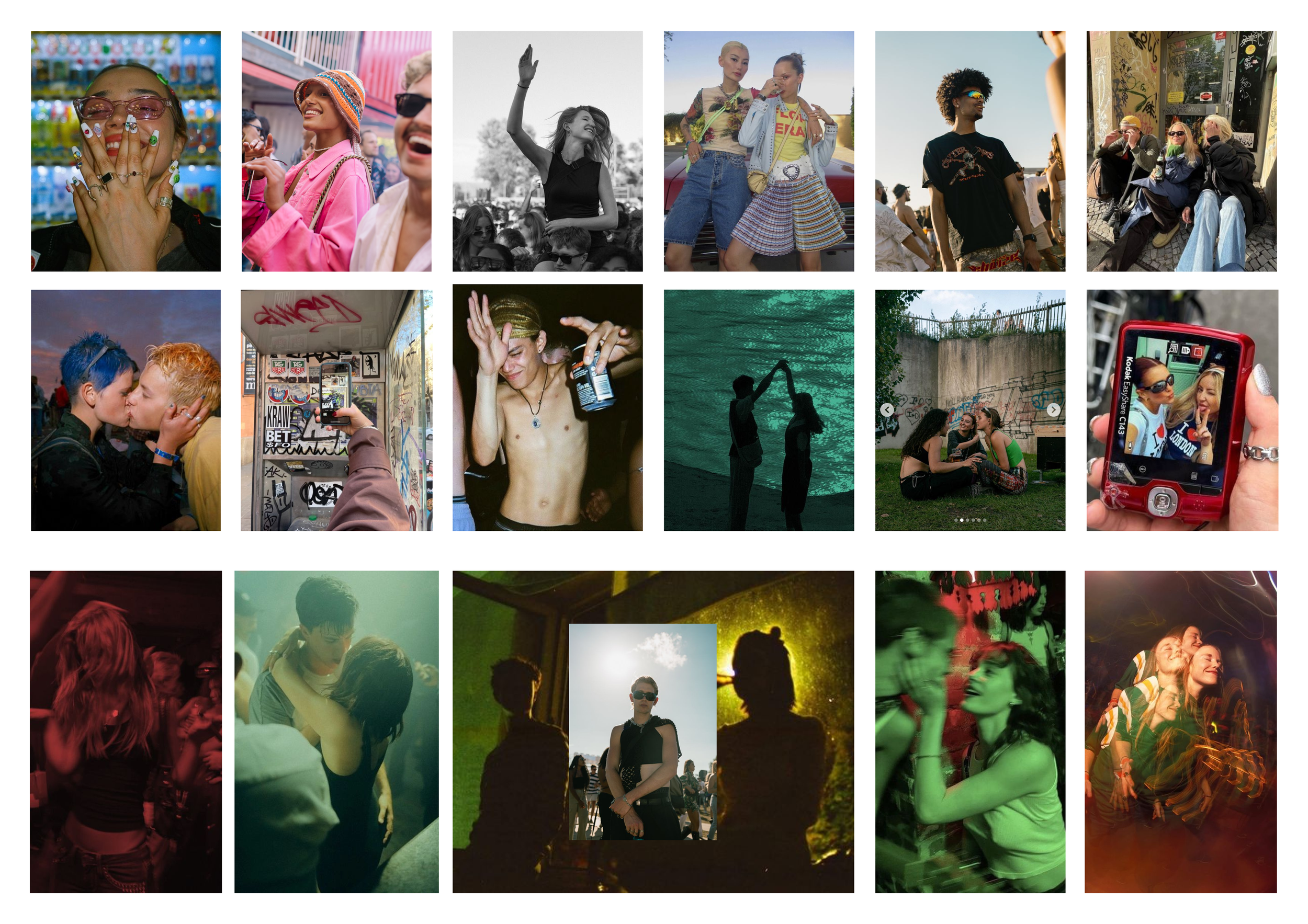
daytime & Nightime, connection between eachother, close-upsnightime, crowds, stages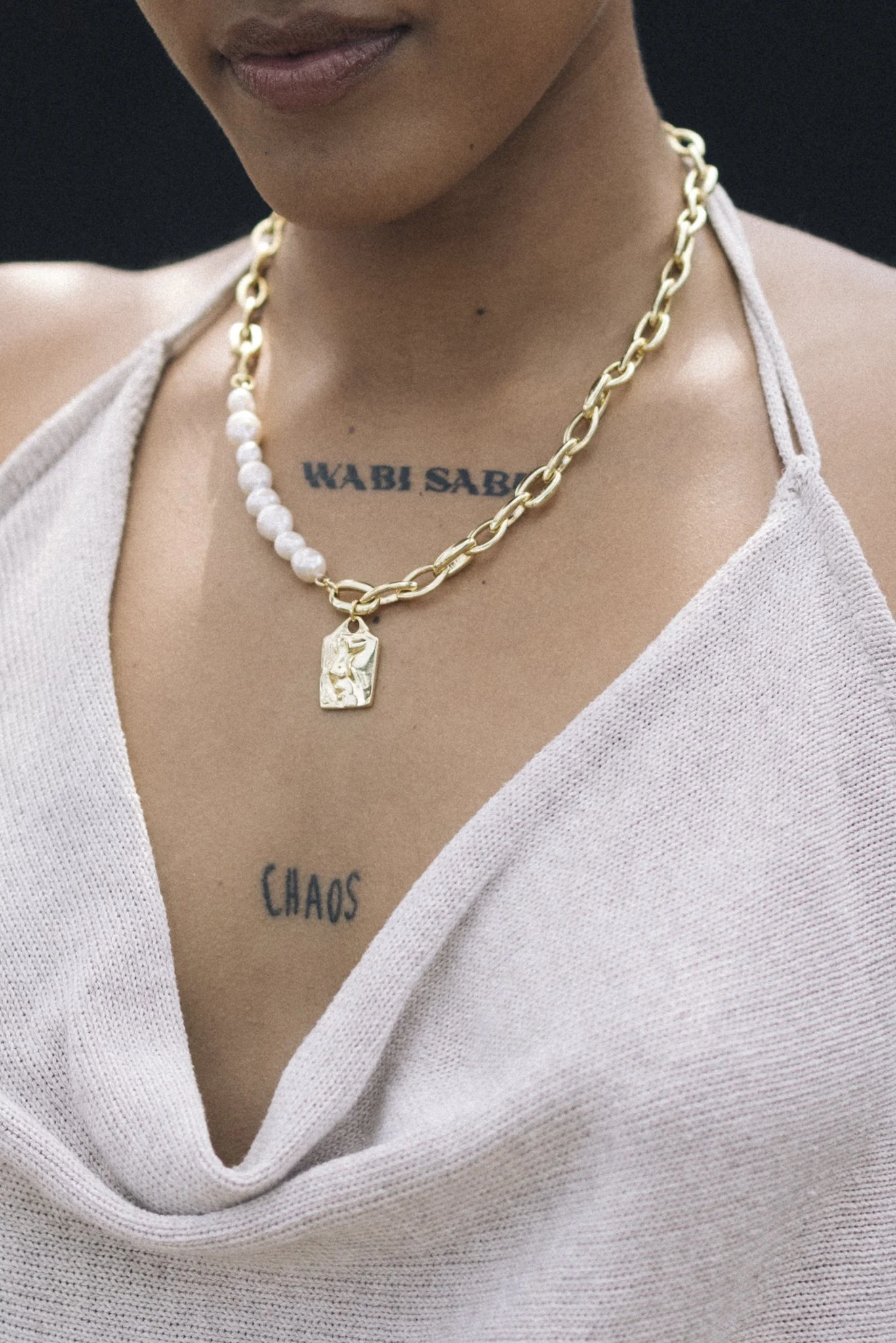

straf_werk 2024 aftermovie